Showing posts with label granulating watercolors. Show all posts

22 December 2025

something different

Last week Bill took our corgi, Butters, outside to play ball. Across the yard and driveway, he saw this Great Egret over by the swimming pool. Not wishing to startle it, he took a quick photo from where he stood — a very distant, out-of-focus photo. 

I’ve been wanting to try less “representational” sketching anyway, so I painted this page using that fuzzy photo as a basis. Mostly granulating watercolors with some gouache patterning added on top. Not quite as I expected it to turn out, but an interesting direction to take my sketching while still capturing daily memories.

23 July 2025

granulating pigments


The pocket palette that I have been using recently (in the upper right corner) held 14 granulating watercolors. But I remembered that I had others that are listed as granulating, some more so than others. Many were remaining pans of colors I no longer have tubes for; that quinacridone gold is one of 2 pans I still have of the original discontinued formula. Others are from small sample tubes.

I wondered if they would all fit in one folio palette — and they pretty much do! I left out hematite genuine (I’m not too crazy about it), bronzite genuine (which has a bit of sparkle to it), and a couple of experimental pans I mixed myself of pigments used in the Schminke Super Granulating line of paints.

The cobalt blue is new to me. The guy that taught me about watercolor included it in his palette of 12 colors. At the time, I used Cotman student grade paints and I didn’t see much difference between cobalt and ultramarine. This week I bought a small tube from Daniel Smith just to give it another try.

I think I’ll keep these stored in the folio pan, removing only those I want to use in smaller palettes for various projects. 


This color chart was also an exercise in precision for me. For several years, I have experienced a slight uncontrollable shaking in my dominate right hand. Not all the time and not predictable. Later this month, I’ll be seeing a doctor to try and figure out what it is. But for today, slowly painting out these rectangles was a good practice in keeping my hand steady. Sometimes concentrating helps.


18 October 2024

seasonal color changes


Recently, Art Toolkit’s newsletter included a feature on creating a Monochromatic Palette with artist Jill Gustavis. Her palette inspired me to put together one of my own using some unused pans of paint. But with my love of color, I still managed to find a simple rainbow range in these “neutrals”! Then sketched an old salt & pepper set from Bill’s grandmother. Technically not monochrome since I used both brown and blue, but I love the subtlety of this palett’s combined colors!

My triple-whammy of flu, strep throat, and Covid is gone now, but I’m still a bit tired (or is it laziness?) — sketching palettes is undemanding. And it’s past time to switch to using my favorite autumn palette, full of earthy granulating watercolors. I should’ve chosen to sketch something that really shows the granulation off, but this wee mouse house was handy, on a shelf next to the salt & pepper set.

26 November 2023

some things can’t be rushed

As I was recently reading all the Hercule Poirot mysteries, the following quote especially made me laugh:

“. . . there are three things that cannot be hurried — le bon Dieu, Nature, and old people.”  — Hercule Poirot, Mystery of the Blue Train

So after jotting it down in my journal, what better way to illustrate it than by sketching leaves from our last camping trip — over a year ago! Better late than never. I’m glad I remembered to take a picture of them


In this Drawn to High Places limited edition Pocket Palette, I keep a collection of granulating watercolors. Most are from Daniel Smith, but the “volcano” colors and the tundra blue are from Schminke. I used a Rosemary & Co. R10 travel brush.

The color swatch card is folded in half; on the inside and back pages, I made samples of color mixes attainable from these colors.


24 October 2022

one wee rose


While shopping in Tomball, I saw this tiny rose growing on a shrub near where we had parked our truck — so I pinched it to sketch later! 🤭 The actual colors were more pink but I painted it with my earthy granulating palette instead. The actual rose is smaller than the sketch, the bloom being only 3/4 of an inch.


15 October 2022

granulating palette, tweaked

In my previous sketch, I had trouble painting the plastic scrubber and red rock using my current palette made up of earthy, granulating watercolors. There are not many red pigments with granulating properties to choose from.

I had seen reviews in the past year of Schmincke “super granulating” watercolors. Most reviewers were not that impressed since most of these are convenience colors easily mixed from more common pigments. But when I saw Volcano Red, I definitely wanted to try it. It’s made from a single pigment (PR108) but it’s the prettiest cadmium red I’ve seen — more subtle than I remember from years ago.

I bought it in a set of three small tubes; the other two are Volcano Violet and Volcano Brown, both mixtures containing Volcano Red. Not sure either of them are worth buying again, but I think the red be will remaining in this and my regular palettes from now on.

I also wasn’t happy with Lunar Blue in this palette. Though lovely, it is a weaker paint that takes a lot of work to get much color. In the super granulating line, Schmincke has a Tundra Blue made from ultramarine blue (PB29) and a brown (PBr7). Instead of buying it, I mixed some ultramarine blue and raw umber in one of my pans, stirring well with a toothpick. A great, versatile blue that is still a bit earthy and more granulating than ultramarine blue by itself.

I also switched the burnt sienna out for the more vibrant transparent red oxide. The color swatch card in the upper left shows the previous colors.

22 September 2022

testing ink and welcoming autumn

This is the last of 4 “shimmering” ink samples I bought, looking for an ink that would change color while writing text. Not much variance with this ‘Emerald of Chivor’ from J. Herbin but the color is lovely!

And just because autumn has arrived, I switched to my “earthy granulating” palette for everyday use. And drug out this Derwent Graphitint palette to play with as well. 

Then drew it directly in ink while I was at it.


my “Earthy Granulating” palette

28 December 2021

earthy granulating pocket palette


Just in case anyone was curious as to what colors of watercolor I placed inside my latest Pocket Palette . . .

I left one of the large mixing pans in the palette (it came with 2 of these large mixing pans and 12 tiny mini-pans) and added 10 standard pans filled with my favorite granulating paints (filled from tubes). I bought this coppery gold palette because it was not silver or black like my others from Art Toolkit; I can easily tell at a glance which of my palettes is the granulating one.

Before posting this, I wanted to paint a simple landscape on the opposite page using this set of colors -- but I am so fed up with the paper in Stillman & Birn sketchbooks that I changed my mind. Not that the paper is bad -- it is wonderful paper for sketching in pencil and ink and a bit of watercolor for color. This is one of their Beta books which is heavier paper better suited for paint.

But I want to apply wet washes of watercolor and allow them to mingle on the page together -- paint just dries too quickly on this paper to do that. Also, the smooth finish does not show granulating pigments off to their best affect; for that, I need cold press or even rough watercolor paper.

Only a few pages left in this journal anyway; hopefully I will finish it by the end of the week, then start off the new year with a new sketchbook journal.


29 November 2021

just a few oak leaves


We live on the edge of the Piney Woods with mostly loblolly and longleaf pines. But there are also many varieties of oak trees — I sketched fallen leaves from just a few growing near our barn-house. The paper in this Stillman & Birn Beta sketchbook is not the right texture to show off the granulating pigments.

27 February 2021

mixing a new granulating color

I’ve been seeing several online reviews about Schminke “super-granulating” watercolors; most say they like some but all can be easily mixed with existing colors and there is no more granulation than normal.

My favorite color is “glacier green” made up of PR233 and PG50 (potter’s pink and cobalt turquoise light), both of which I have. So I mixed up a pan, stirring with a toothpick. After painting it out, I think it may have needed a bit more potter’s pink.

Here, I tried Daniel Smith’s cobalt teal blue (still PG50) in the mix on rough watercolor paper showing more granulation. I also tried my other turquoise paints: cobalt turquoise (PG36) and phthalo turquoise (PG36 + PB15:3) — the phthalo mix is way too overpowering! That’s why I’ve mostly stopped using phthalos.


As long as I’m playing around, I also tried my own version of “deep sea green”, PG18 and PB29 (viridian and ultramarine blue) — I substituted Jadeite genuine for the viridian.


18 February 2021

testing Derwent Graphitint paint pan set

I had some art supply funds left over from my last Etsy sale so I went “shopping” for fun. A few years ago I noticed the Graphitint colored pencils: pencil graphite combined with watercolor for muted colors with lots of granulation — both things that I love. But everyone posting reviews mentioned they are definitely NOT lightfast, some colors fading quickly even in a closed sketchbook. So I was a bit leery to spend money on these.

Reviews on this new paint pan version had better lightfast ratings so I got a set and made my own test. One swatch has been tucked in my sketchbook; the other has been taped for nearly 3 weeks in a south window in full sun. So far, no noticeable fading, but I’m leaving the window swatch in the sun another month or two to make sure. The colors are more pastel than my usual Daniel Smith watercolors.

Some colors lift better than others, using either an eraser or a damp stiff-bristled brush. The boldly circled numbers are the company’s lightfast ratings with 6 or higher considered lightfast. Lighter lower numbers are those listed for the Graphitint pencils with the same color name.

I also tested a page of using regular watercolors combined with water-soluble graphite pencils. Paint added to a graphite sketch was too muddy; this combination works best if a bit of graphite is lifted off the end of the pencil with a wet brush, then mixed with watercolor on a palette.

02 October 2020

random journal pages


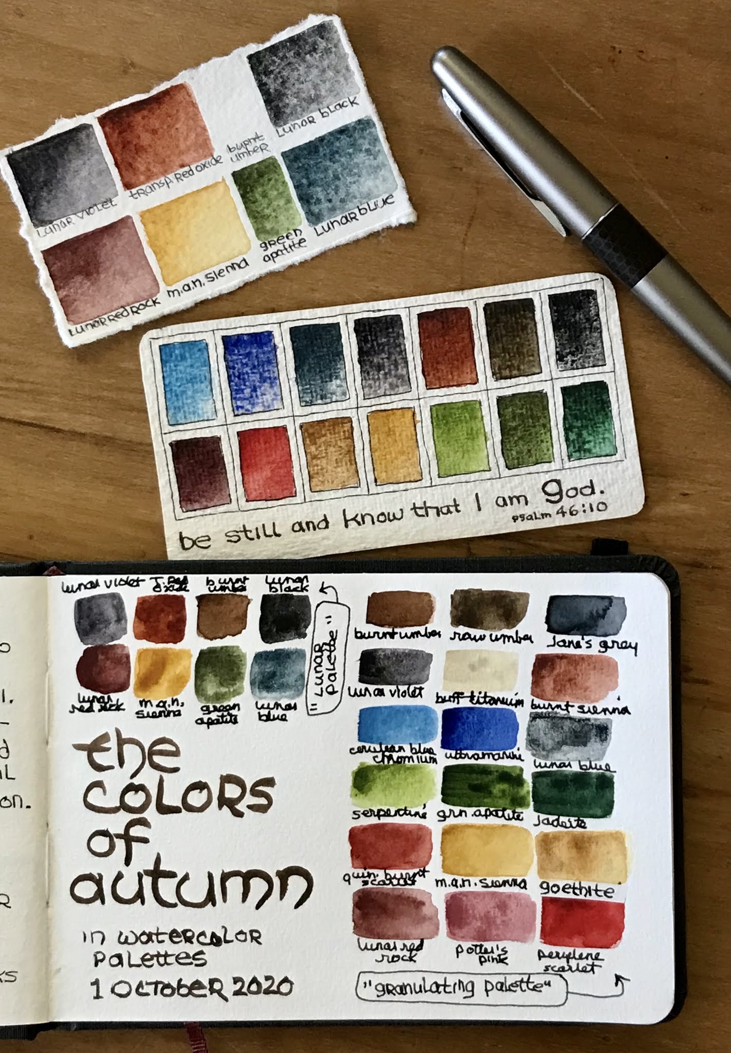
The past few days I haven’t spent much time in my sketchbook . . . but Autumn is upon us, prompting a switch of palettes. I’m not sure why but at this time of year I am drawn to earthy, granulating colors — especially since we don’t really see much color change in nature here.


My iMac laptop was officially a dinosaur, being unable to sync with my phone or mini pad. I didn’t wish to replace it with another computer but I still wanted the option of a keyboard. So with our son Jason’s help, I got this iPad Pro with keyboard and Apple Pencil. So far, so good. Except that Blogger does not play well with Apple products, making blogging a challenge.


18 January 2019

more limited lunar palette


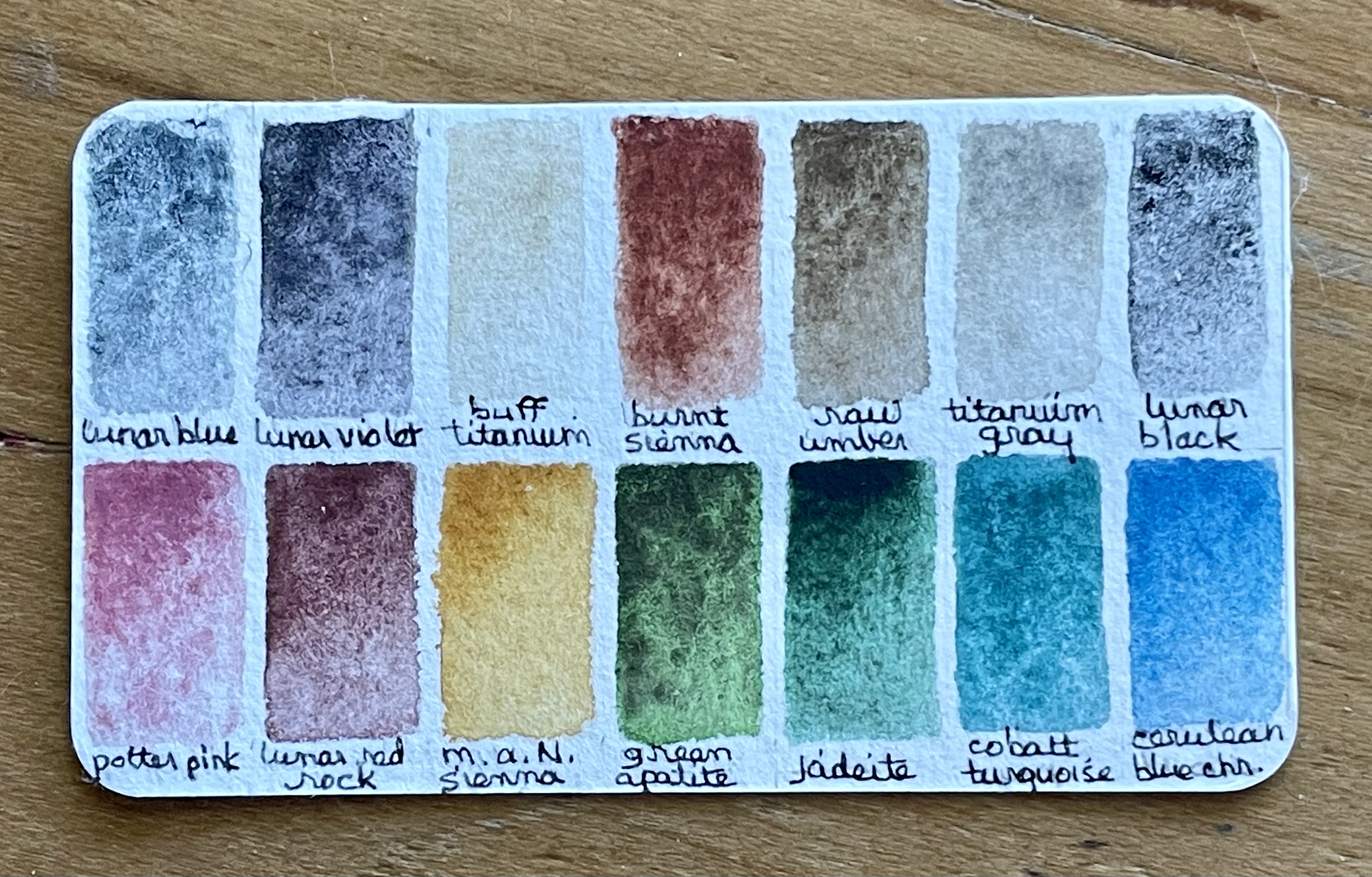
I wasn’t sure how the limited palette I recently put together with Daniel Smith lunar watercolors would work so I made a color chart. These pigments are muted earthy granulating colors, which I love, but seeing the mixes obtained with them makes me think that they will work better if allowed to mingle together on the paper, not pre-mixed. I think this set would work best when adding a touch of color to an ink sketch rather than a direct watercolor piece. Especially a sketch in brown or sepia ink!

(There’s also a lunar earth but I prefer transparent red oxide for an earth orange.)

At first I added buff titanium to the empty space left, but the mixes show that there isn’t a noticeable difference between mixing with buff titanium or just using a thinner wash of the single paint. So when I put together a smaller version in a pocket palette, I switched this space to raw umber. I could mix a similar color with the transparent red oxide but it’s convenient.


12 October 2018

some autumn color . . . in rocks


Today I was just in the mood for color in my daily ink sketch. So I picked up some rocks as Bill and I walked the circle drive where we live. (OK, only half the circle but it’s progress — Bill is not light-headed any more since the doctor dropped his blood pressure medicine.) The small rock in front looks very dark in the photo — it is actually a bright red jasper.

The ink sketch is with a sepia ink that I mixed from Noodler’s polar black and polar brown. But the rich watercolors in my earthy granulating set seem to take over, obliterating the ink lines!


17 September 2018

new journal


Over the past few days I’ve started a new sketchbook journal, adding a bit here and there. This time I’m trying out a Stillman & Birn Zeta in landscape format, 8.5 x 5.5”. First is a quote from Cathy Johnson on keeping art journals, with a random stack of sketchbooks.


The box on the far right is to enter personal contact information in case the journal is lost.


Then, as always, I drew some sketching tools on the first page — this time, a collection of granulating pigments I put together (listed to the left of the palette). Autumn is approaching and it always puts me in the mood for earthy granulation in watercolor.


We are still “living” at Scott & White hospital in College Station following Bill’s second bypass operation. A new bypass procedure was required when one from his surgery five years ago failed; they also found another questionable area forming a possible future blockage and decided to take care of that while they were in there. He is recovering much quicker than the medical personnel expected — this surgery, while much longer and more complicated than his first bypass, has been a much better experience with considerably less pain and discomfort.

Bill brought home one of these insulated water mugs when he had disc surgery, and has loved using it for iced tea. But that mug is finally separating and broken. I thought this a rather drastic way for him to get a new one!

We are so thankful Dr. Kirby was able to fit Bill’s surgery in an already busy schedule! From everything we’ve heard, he is the very best heart surgeon in the area, practicing at all three hospitals. Bill’s surgery was on Thursday; on Saturday, Dr. Kirby had an accident on his bicycle . . . and now he is a patient here as well, dealing with some very painful broken ribs. (He is the same age as me, 64. Maybe he should slow down?)


30 August 2018

taking a break . . .


For several weeks, I have taken a break from regular daily sketching. At first it was due to sewing a birthday teddy bear — the bear is now finished except for a small cat appliqué I ordered to sew on the bear’s sweater. Judah loves cats, stuffed animals, and “the dark side” of Star Wars — I chose to limit the dark side to knitting a black sweater for the bear and giving him his own stuffed kitty.

Then “life stuff” kept distracting me. Our cabin and woodshop needed painting and it’s been in very small increments due to 100+ degree days. Usually this part of Texas (at least in the country away from all that pavement) sees a few 100° days interspersed with more comfortable 90s, but this year has been extremely hot. Limiting work time outside. Bill had moments of feeling completely wiped out, which is unlike his work-a-holic character.

Meanwhile his 5 year struggle with chronic pain (due to pinched or damaged nerves, or so we’ve been told) led us to seek out an acupuncturist. We found a highly experienced, reputable one originally from Vietnam (Dr. Tam Khai Thai) and hoped for the best. Unfortunately, because of Bill’s neck surgeries (which Dr. Thai agreed with the spinal surgeon was supposed to fix this), he is unable to help. The fused discs in Bill’s neck prevent treatment from being possible.

The most recent pain killer Bill has been on doesn’t help anymore and it’s one of those that cannot be stopped “cold turkey”. So he made an appointment with our regular doctor to begin coming off of it. As long as he was there, she did a full exam . . . and his recent shortness of breath and weakness alerted her to possible heart trouble. So, with his having had a major heart attack 5 years ago, she sent him to a cardiologist. Who totally agreed with her — he said it’s as if Bill had a list of warning symptoms and checked off every box. (We had thought it all due to overworking in the extreme heat).

So now we’ll be heading to College Station on Monday for a catheterization and possible stints.


Oh, and that palette in the first photo? While I haven’t felt much like sketching lately, I did tweak my granulated palette a bit, switching the previous muted earthy colors to a few brighter colors. I may still remove the burnt umber to make room for lunar black, which has wonderful granulation. I was also trying out my new favorite paint brush, an Escoda Aquario Petit Gris squirrel hair, size 8. Love the brush!

09 April 2018

a cleaning day


I store tubes and sticks of watercolor in a deep drawer of an antique wooden toolbox, with paints already squeezed into pans and allowed to dry stored in a shallow drawer just above the paint drawer. Over time, it gets vary messy, though I dotry to keep the paints in roughly the same order as I place them in palettes. There were several colors that I’ve stopped using or some I tried due to other sketchers’ experiences — I decided to clean these out and settle on just the ones actually used.

Some of those on the right hand side are only used once in a great while, or only in a special granulated palette. So my “core” palette is usually made up with 10 to 14 of these. I will miss the old quinacridone gold (no longer available). I still have some squeezed and dried in pans. But it has been removed from the overall stash.

24 October 2017

finally! I found another one . . .


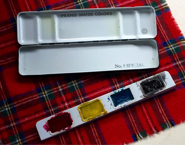
The upper vintage Prang watercolor box is one I've had for years. I love it's being metal yet so much lighter in weight than modern metal watercolor boxes. And a full-sized brush fits inside, depending on how many pans of paint I put inside.

A couple of years ago, I foolishly took my Prang box to the beach --- we were camping right at the gulf shore on Mustang Island. Lots of wind and sand! My poor box was sand-blasted inside and out as I sketched and painted! 

The paints were able to be cleaned up without too much loss but the inside finish of the box was ruined. I tried sanding it down and spraying with an enamel paint, but the surface still fought my mixing paints on it.

Now and then, I would check on eBay but these boxes have caught on in popularity; average prices were $25 and higher for boxes in poor shape with rusty areas. I was willing to settle for a box from the 1950's though I do love this Art Deco version with it's wee Old Faithful geyser, as long as the inside was in good shape,


And finally I found this one for only $10! I didn't know the Prang company had a primaries version. I removed the tray and set my own pans in place -- this time, using pans with a magnet on the bottom to hold them in place easily. 


And here it is, filled with an earthy granulating palette for autumn. (Granulation without all that sandy grit furnished by the Gulf of Mexico!)

15 October 2017

the colors of autumn


Our oak trees do not wear the glorious yellows, golds, oranges, reds, and purples of the maples and other trees back in Kansas. Those leaves that turn in the autumn simply turn brown; some oak trees around here are actually evergreen (who knew?) and stay a rich green year-round.

If I can't enjoy the colors of autumn outside, I can at least change my watercolor palettes to reflect the season --- Here are my cleaned-up and refilled palettes, full of earthy, granulating pigments. And, typical of me, I made changes after sketching these pages! The earth-red is Jane Blunder's favorite, Indian red: a gorgeous shade but very opaque. I wondered if Daniel Smith's Primatek "garnet genuine" might be a good granulating red while still being more transparent. It arrived yesterday, so I switched out the Indian reds for garnet.

Then, since burnt sienna and transparent red oxide are so close in color, I took the sienna out of my pocket palette and added a cobalt blue. I have been greatly influenced by Jane Blunder's blog and her amazing studies of pigments and what they will do.

Another change: Apple has finally updated their products to where I can no longer post photos to my blog using other devices. The problem is that Blogger refuses to upgrade their apps to the newer Apple systems. I can still post using my ancient iPad 3, but it's camera is not as good as that on my phone. So here I am, posting on my computer instead . . . and realizing how rusty my typing skills have become since relying on iPad, iPod, and iPhone!

22 September 2016

more Epsilon testing


My new Stillman & Birn Epsilon sketchbook has a smooth plate surface and is designed primarily for pen & ink or pencil. But I decided to test really soppy-wet wet-in-wet watercolor on a page to see what happens. Then I thought, why not see how masking tape and liquid masking fluid work as well? Water literally floated on the surface as I dropped in a few granulating watercolors and let them move around.

As you can see, it did remarkably well! After the paper dried, there was very little warping. The masking tape pulled up without any damage to the page's edge. Even the liquid mask _would_ have worked . . . I thought it was completely dry (the surface felt dry), but apparently there was one spot the under layer was still damp enough that rubbing the mask off tore the paper.


I was using this older set of granulating earth colors that I put together a few years ago. These colors just sing to me "Autumn!"

Later at church, I was fiddling around on the back of this page with several fountain pens. The extreme wet treatment of the painted side did not effect the back side's paper at all!

Related Posts Plugin for WordPress, Blogger...