Showing posts with label limited palette. Show all posts

30 August 2025

simplifying

While my other Folio palette now holds a standard sized pan of every granulating watercolor I currently own (30 of them!), I reconfigured this Folio for simplification. Both of the large palettes live on my art desk. I decided to try this one with just a limited palette in double pans arranged around mixing pans — similarly to how I arrange mini pans in a Demi palette.

As much as I love unusual pigments, it would make an interesting challenge to stick to only 9 colors. Two of those I included are new to me: cobalt blue and moonglow. Just giving them a try for now. Normally I would have cerulean blue chromium instead of cobalt blue.

From the lower left working around, the paints are quinacridone rose, hansa yellow medium, green apatite, cobalt blue, ultramarine blue, moonglow, monte amiata natural sienna, transparent red oxide, and burnt umber — all from Daniel Smith.

Here’s a look at my other Folio palette filled with granulating watercolors. I am not a paid representative for Art Toolkit, who makes these palettes — I just love their versatility and compactness! All sizes of pocket palettes can be found by clicking HERE.


24 June 2025

revisiting an old palette


Recently I pulled out a sketchbook from 5 years ago, intrigued that I had actually stayed with the same limited palette and 2 ink colors throughout the entire book. I could not replicate the colors exactly, as I no longer have a couple of them, but I put together a similar palette for this muted color chart in my current sketchbook.

The thin sketchbook of 140 lb. 100% cotton watercolor paper was a dream to work on! I began it on my birthday; including turquoise was influenced by the turquoise elastic band that came with the book. If I remember right, I even stuck with exactly the supplies shown on the first page!


08 June 2025

Palettes of Place?


Does anyone following Art Toolkit remember their “Palettes of Place” blog entry in March 2020? That one was about the Pacific Northwest Demi palette, a collaboration with artist Molly Hashimoto, author of “Colors of the West” (one of my favorite books!).

I just put together this copy of the palette, with a few changes: quin. red or carmine for perm. alizarin crimson, Fr. ultramarine for phthalo blue RS, my own mixed violet for carbazole violet, monte amiata natural sienna for yellow ochre, and transparent red oxide for quin. burnt orange.

What I wish to know is: Were there ever any other “Palettes of Place” color collections? Or was this one more thing interrupted by Covid?


22 February 2025

palette play


Lately I’ve been doing a lot more reading (with a hot cup of tea — it’s cold out there!) and less sketching, but I managed to play around with some palettes inspired by other artists. I even bought a few new colors to try out (especially when found in smaller sample-size 5ml tubes). If I already had a similar color, I made substitutions. This is one reason I love collecting Art Toolkit palettes so much — it’s easy to switch out the magnetized pans whenever I get a whim to try a different combination!


The first palette shown is inspired by Jill Gustavis (seen here). I love her idea of sky colors above, earthy colors below. My substitutes include cerulean blue chromium, potter’s pink, volcano red, quin. magenta, nickel azo yellow, and raw umber.

The next set from Robin Lee Carlson (find her work here) includes fuchsite genuine, a subtle green that intrigues me. I especially love Robin’s nature studies! I substituted quin. red.

The third set was found several years ago on The Animated Woman’s Instagram account, when she was sketching with a water-soluble Elegant Writer calligraphy pen. These colors compliment the colors that can be bled out with a damp brush. The colors look wintery to me, to go along with these colder-than-normal days.

16 November 2024

and the winner is . . .

After watching Lisa Spangler @sideoats do a short video mixing quinacridone magenta and peacock to get a near-blue, I decided to stick with this Christmas palette being most close to the @lettersparrow Holiday Hues palette. I already owned most of the colors in the collaboration palette but for those who don’t, I highly recommend ordering from Letter Sparrow!

(That’s a Christmas colored lap quilt in the background, sewn by my mother❣️)

22 September 2024

It began with a sticker . . .


This week I am getting a new iPhone, so I ordered a new case. It came with some small stickers, one of which is a corgi camping; I had set up my green Demi Palette for using when camping in the forest and my corgi camps with us — so I added the sticker to the palette.

The forest color card folds out to show some of the mixes from these pigments. I also have an alternate color card should I wish to not include the mixing palette.


Then I remembered a small cactus sticker (I can’t remember where I got it) — and added it to my “Baby Cactus” Demi Palette. 


While I am personalizing palettes, I removed the paints from my Triad Pocket Palette, moving them to another pocket palette. Turquoise / Teal is my favorite color so I moved my most-used colors to this case. These are the colors of our part of Texas, influenced by Lisa Spangler’s Gulf Coast & Texas prairies choices from a few years ago. Originally I put it together as a Demi Palette; the larger size includes two new colors (Schmincke’s Shire Blue & Letter Sparrow’s Black Current) just for fun.


UPDATE: True to my normal habit, as soon as I posted this I made a change in the “Texas” palette! Potter’s Pink is not in Lisa Spangler’s original set that inspired this palette, but she includes an orange and a violet. Since Black Current is similar to Potter’s Pink, I removed the pink and added mini pans of orange and violet.


31 August 2024

camping, part 2

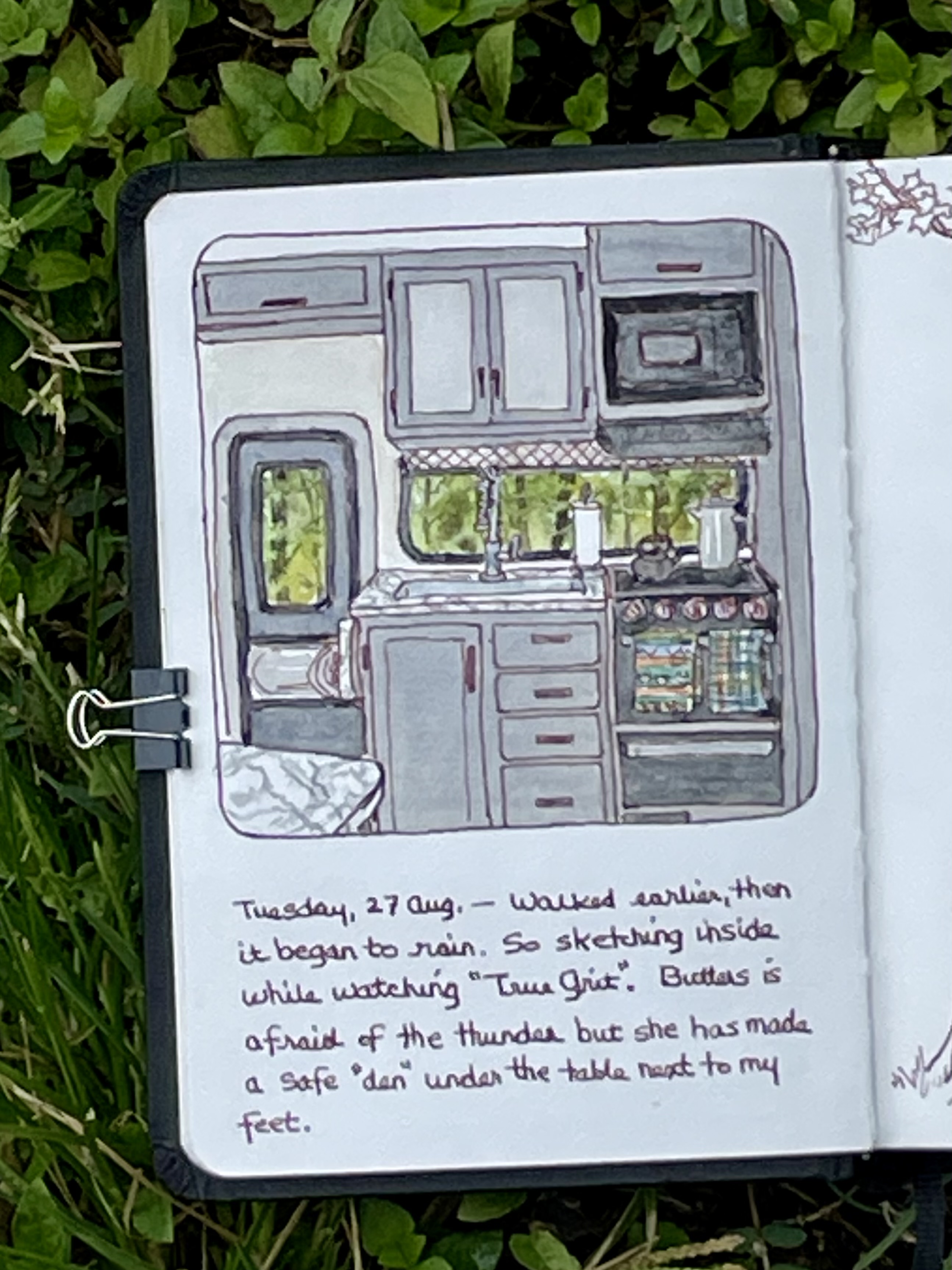
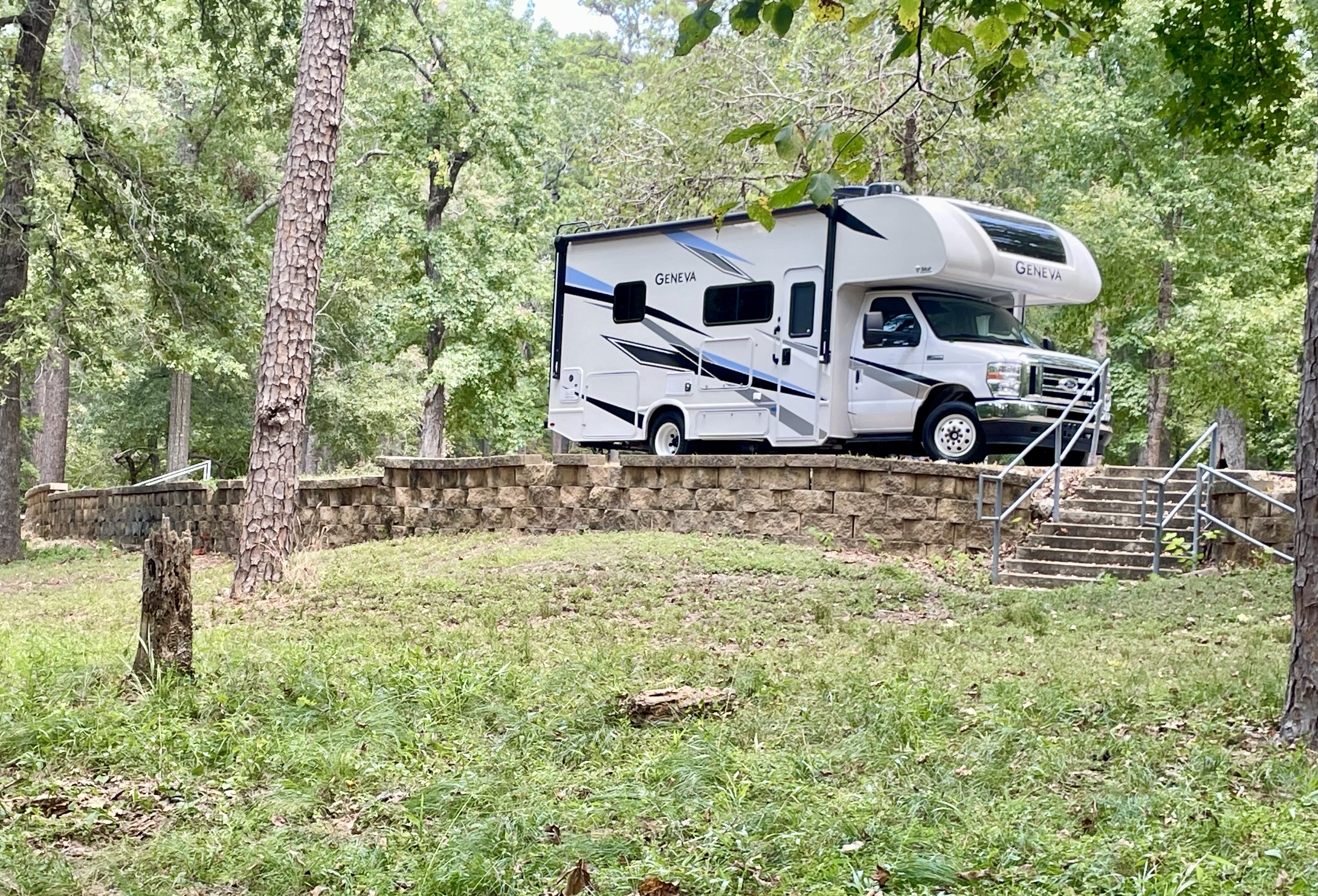
Stormy weather caught up with us on Tuesday afternoon, so we retreated inside the RV, where I sketched this. Butters, who does not like thunder, stayed under the table as I sat there sketching.
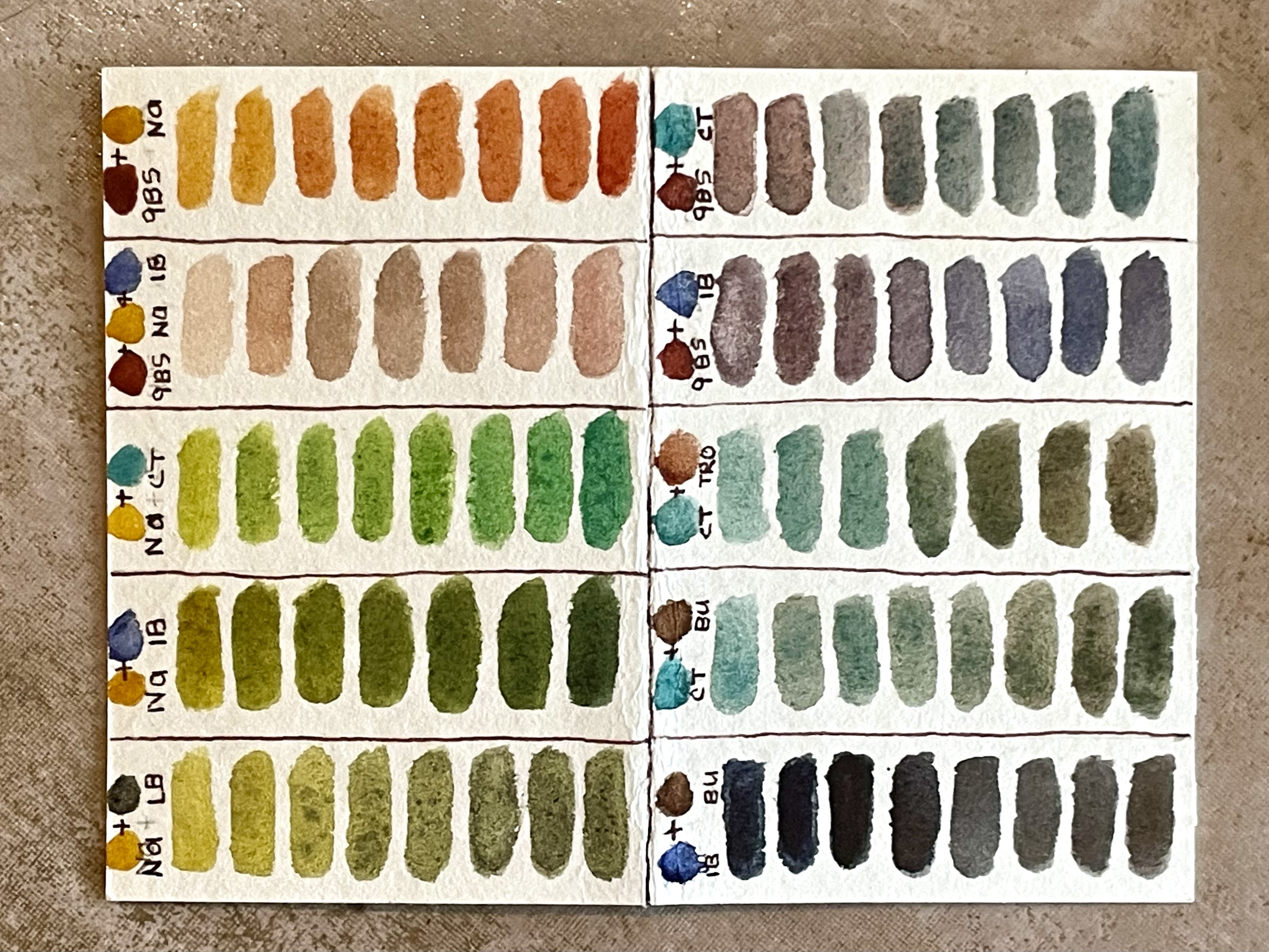
Next, I sketched the key fob — but I did not have turquoise or buff titanium in my palette. I did add 4 convenience colors to this limited palette; just not the ones needed for the camper charm. So I did some color mixing studies.
Trees sometimes take on very interesting forms during their lifespans. These two sketches captured two of them near our camp site.


26 July 2024

tweaking a Demi Palette

Trying out new combinations of colors is the main reason I love Pocket Palettes. With magnets holding the pans of paint, it is so easy to change my mind!

After putting together a new combo in this Demi Palette to go with the Shire Blue watercolor I just bought, I tried a quick landscape (Making imaginary scenes is hard for me; I just roughly painted something seen online). Then decided the warm yellow and phthalo blue were just wrong for me.

So those were switched out for two others — I know I can mix the browns but it’s so much easier to start mixes with transparent red oxide! I tried another landscape, this time in my tiny sketchbook (which I found out was not so good working wet-in-wet!). I think I like working with these colors.

07 May 2024

waiting to be toasted


The weird low-fiber diet I’ve been on for three months is lacking so many good things, but at least I can enjoy cinnamon toast! I keep the bread in the freezer, breaking off a couple of slices to toast whenever I want some.

I combined my limited palette based on 19th century watercolors and what I call my “Texas gulf coast, prairies, and piney woods palette” in the same Folio palette, separated by plenty of mixing spaces.

🎉🎊🥳 After sketching this I had a virtual follow-up visit with my doctor — he took me off the silly fiber-free diet and now I am free to eat anything! Woo-hoo! Bring on the fruits and veggies! 🥕🥬🫛🥒🍅

(Drawn in continuous contour line with a Kaweco Supra fountain pen.)


18 April 2024

playing with color, again

Recently, a comment was made on a blog entry I wrote in November of 2011 after reading a past issue of Watercolor Artist magazine about pigments used by artists in the late 19th century. At the time I came up with my own version of similar colors using quinacridone gold as my yellow — the original single pigment quin. gold that is no longer available. (The new version, while close in color, does not work the same in mixes!)

So this week I’ve played with my current paints, putting together an updated version of this limited palette, sketching it in my tiny sketchbook. Then I tried it on completely different paper (a blank refill for my passport size Traveler’s Company notebook). And then I painted a swatch card to see what mixes can be made.


Playing with my watercolors and pocket palettes makes me happy! 😊 

(And yes, I managed to sneak in a turquoise! It’s my favorite color and I figured it can substitute for the greens and cooler blue that were originally used. The original pigments artists used are listed on the left-side page of the Traveler’s refill.)


27 February 2024

first violet of 2024

Early this morning Butters and I were exploring when I spotted this tiny violet. So I sketched it in my tiny sketchbook.

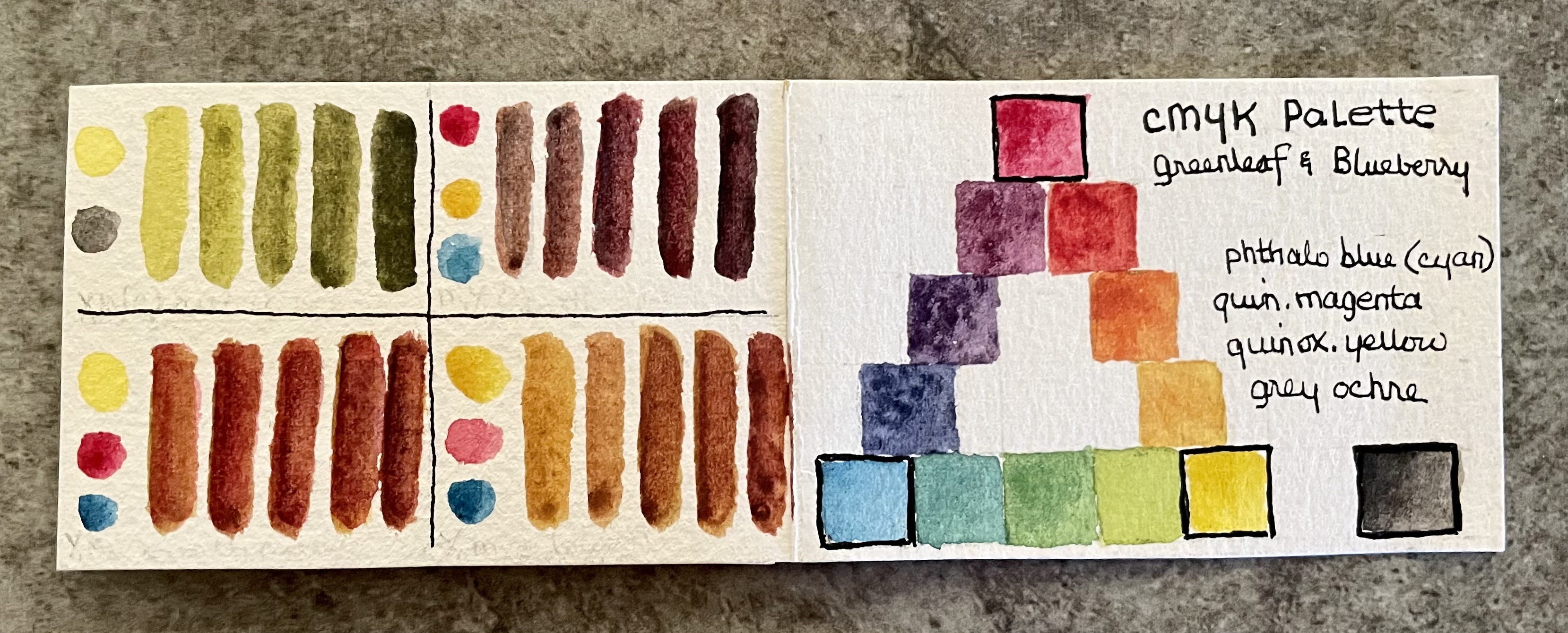
I’m keeping the 2” sketchbook, a tiny Pigma Micron pen, paper towel, small waterbrush, and my CMYK Demi Palette in a large cotton bag from Art Toolkit.

In addition to cyan, magenta, yellow, and black from Greenleaf & Blueberry, I added green apatite, ultramarine blue, a raw sienna, and transparent red oxide.


18 February 2024

a combination palette

Sometimes I want to use subtle, muted watercolors for a sketch. And other times, the sketch subject calls for bright colors. Instead of needing to change which Pocket Palette I grab, I put both muted and bright palettes in one.

UPDATE: After posting this, I removed the warm Volcano Red and added my favorite cool green, Jadeite genuine. I can easily mix a warm red by adding a yellow or gold to quin. rose, and jadeite is such a lovely bright green! I especially love jadeite mixed with ultramarine. 

Potters pink is not bright on its own but is a great base for skin colors. And it makes the most wonderful grays when mixed with cobalt turquoise light!


03 January 2024

a muted limited palette


Yesterday I was playing around with some pans of color, putting together a more muted limited palette. The first combination I tried with Undersea Green and Neutral Tint was too dull. Switching them out for Cobalt Turquoise and Lunar Black helped brighten things up!

Making a small swatch card helped in my decision making. Inside are swatch strips of various colors that can be mixed with the two color dots in each section. (I’m especially loving quinacridone burnt scarlet mixed with cobalt turquoise! Similar to the cadmium red mixed with cerulean blue that I used to use.) This card fits in the cloth bag the Pocket Palette is carried in.


30 July 2023

toning it down


Lately I have been wanting to get back to drawing in ink only or monotone sketches. So I put together this monotone palette — plus an extreme limited palette in 4 mini-pans copied from Róisín Cure. Now, what type of subject shall I draw?


07 July 2023

a kolache sort of day


Today we drove to Brenham where I had a regular appointment with my eye doctor. On the way we stopped at the Chappell Hill Bakery for breakfast — I had a bacon, egg, and cheese kolache which was great, as always.


This is my latest purse-sized mini sketchbook (2” square), purchased several years ago on Etsy but unused until now. The craftsmanship is so exquisite that I didn’t want to “mess it up” so it has stayed on the shelf. Until now.


29 January 2023

playtime

Rainy days are just the right time to play with watercolor. After reading Austin artist Lisa Spangler’s email newsletter from last December, I put together a limited palette of her “core palette colors” by themselves. Just to see how they play . . .

(I didn’t have her azo yellow so I substituted Hansa yellow.)

20 November 2022

my minimalist kit


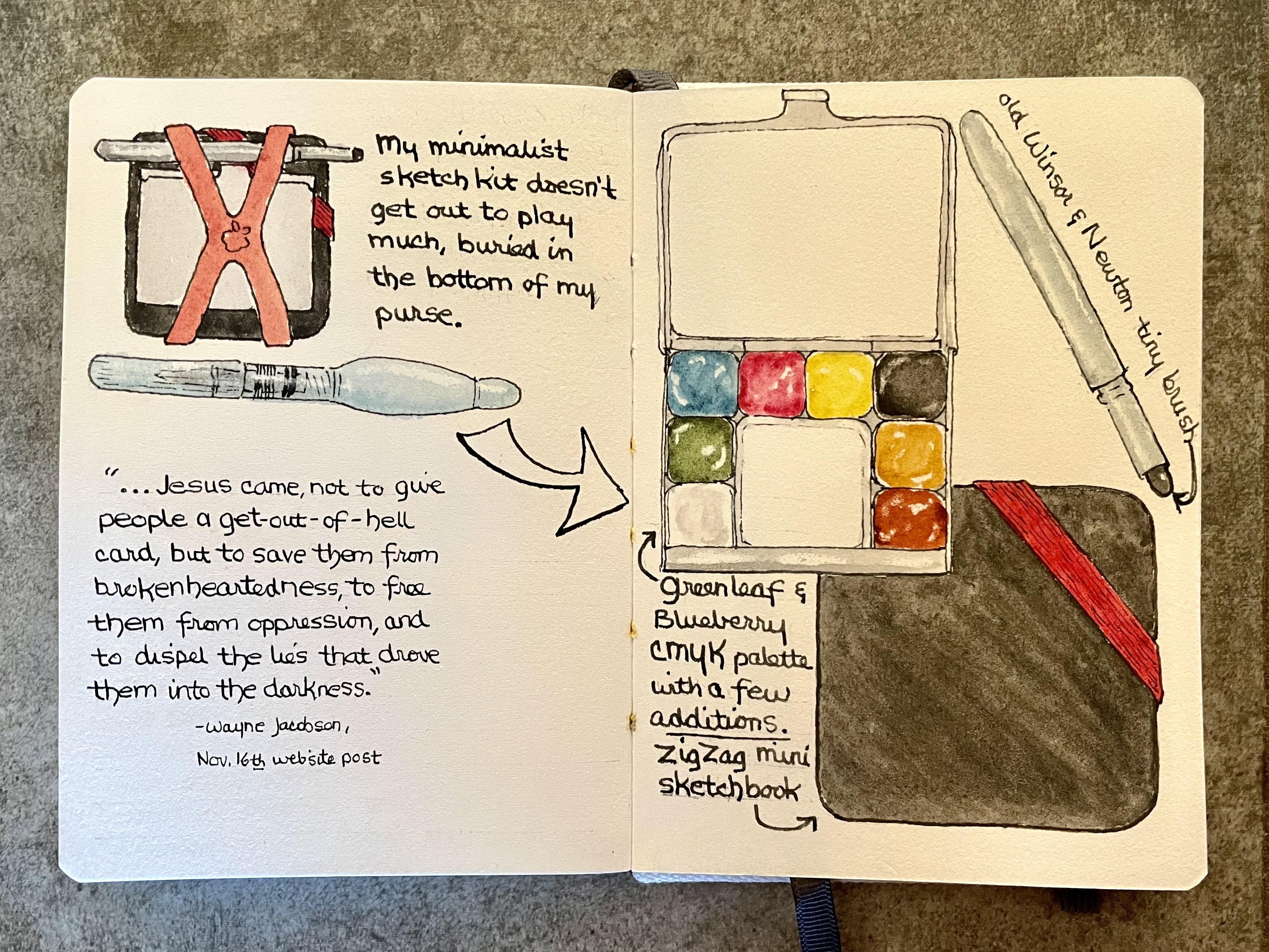
It seems like such a very long time since I have used my tiny sketch kit that lives in my purse. The few times I’m out running errands, I might not even carry a purse — just grab my ID and go. So I took it out yesterday and sketched it.


This kit is made up of a 2” square ZigZag sketchbook, a Demi Palette (mine is the limited edition that came with Greenleaf & Blueberry’s CMYK palette), a tiny paintbrush that came in a Winsor & Newton set years ago, and a mini waterbrush — held together with a small silicone cross band. Art Toolkit now markets this combo as their new Ultralight Sketcher Set.

I also made a color chart card of the four CMYK (cyan, magenta, yellow, and black) paints to keep with this palette, a quick reminder of colors I can mix. I have since added apatite green, monte amiata natural sienna, transparent red oxide, and white gouache.


Related Posts Plugin for WordPress, Blogger...