30 June 2020

journal palette do-over


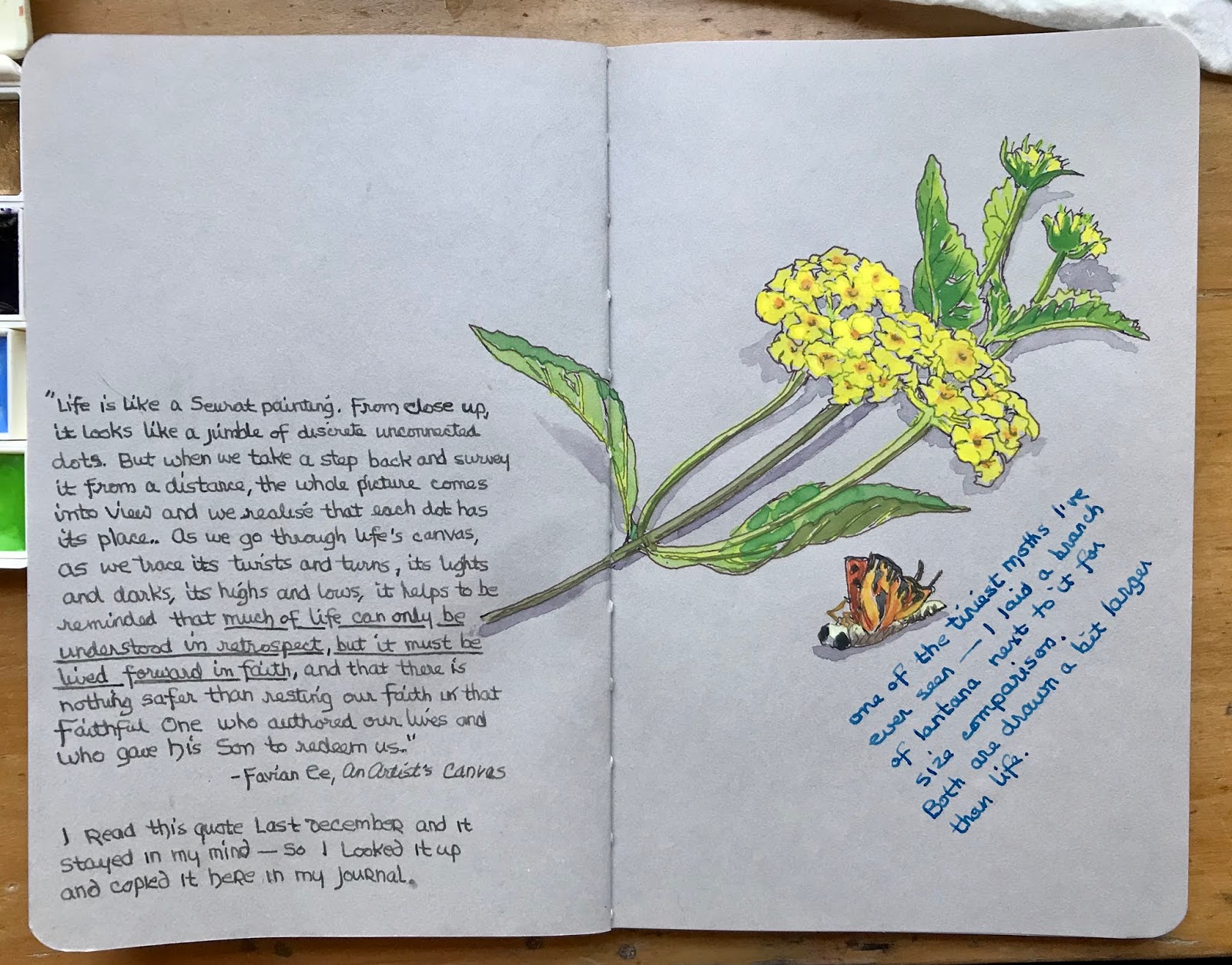
After my previous sketch (the yarn I’m not knitting) in dark gray ink, I realized that I’m really struggling with the gray toned paper of this sketchbook because I’m trying to make it fit my normal tools. My favorite watercolors are cool, subdued, earthy, granulating and neutral pigments — none of which work well on this cool toned paper. It needs bright colors and dramatic ink (crisp black and white) to work well. In other words, CONTRAST!


So I made up a Demi Palette with much brighter watercolors, testing my selections on a back page. And switched to black and white pens: the Kaweco Liliput has the finest nib and the Lamy Safari has a medium nib, which is quite bold. Both hold De Atramentis Document black ink. The Pentel Pocketbrush makes the deepest blacks with its paintbrush tip.

I was amazed that I could add just a bit of transparent red oxide and Jane’s grey to the yellow and match the brass of the Liliput, expecting it to be much harder. And my current favorite limited neutrals palette? It lives in my purse with my much-neglected 2” mini journal. I borrowed a white gouache from this palette to put in the brights palette, replacing it with Jadeite genuine — sometimes ya just need a rich green!


28 June 2020

NOT knitting . . .


I’ve been in the mood to knit something. Or maybe crochet, though it isn’t as relaxing as knitting. I ordered a bit of yarn __I recently found this fun website, Hobbii, that lets you download free patterns of all kinds__ and have some projects in mind.

But I haven’t been sleeping much lately. So instead of beginning something new requiring a bit of thought, I just drew the yarns. The bit of knitting already done is a tea cozy made from old remnants of wool; it now needs to be felted (shrunk and tightened up) in the washing machine. Later . . . when I’m less tired.

26 June 2020

our old windmill


Yesterday I spent most of my time errand running, grocery shopping, and reading. (We went to buy paint but then I realized I had forgotten my chosen paint sample card — couldn’t remember the name — seems like there’s a hundred different “whites”.) 

I wished to draw something but hadn’t much energy left — so I sketched another of Bill’s grandmother’s treasures. This wooden toothpick holder sat on her table for as long as Bill can remember; no one knows who carved it or how old it is.

The waviness of the journal text side shows that when I do add watercolor, I’m still using too much water in my mix. But this is just an illustrated diary so page crinkling doesn’t matter. This Stillman & Birn Nova sketchbook does seem to call for text on the left page, sketch on the right. I’m not sure why, it just does. Sketches crossing the center gutter seem awkward due to the book not opening completely flat.

I used a Lamy Safari fountain pen this time, filled with my own “burnt sienna” mix of De Atramentis Document red plus a wee smidgen of black. A few highlights were added at the last minute with a white colored pencil.

BTW, if anyone is interested in the text quotes I jotted down on the left page, this and 2 other books can be downloaded for free from Wayne Jacobsen’s website, HERE.

24 June 2020

let sleeping cats lie


One of Bardie Mac’s favorite sleeping spots is just under the corner of our bed with his hind feet sticking out. He thinks I can’t accidentally step on him here (he little realizes how clumsy I might be coming around that bed post!).

Cats seem to be either “ground dwellers” preferring spaces under furniture, or “tree dwellers” choosing spaces that are above everyone else. Bardie definitely goes to ground while his brother Scottie Dubh can be found in the high places such as the top of the cat tree.

Bardie’s coat is what they call “smoke” — each individual hair is white near the skin and black at the tip. His feet are white except for a couple of black spots on the back of two feet. Smoke is not an easy color to paint!

21 June 2020

the last cactus bloom


This sketch is from a photo of the last bloom on our prickly pear cactus last month. Buds were a deep rose when they began before opening up to a brilliant icy yellow. Then as they began to wilt they once again showed a rosy tinge around the edges.

Never having been around these plants before, we are now wondering when (or if) we can expect the fruit to show up.

20 June 2020

Grandma’s tools


Lately my hands have been itching to do some knitting or crocheting. I found this great online site, Hobbii, that offers free patterns I’ve been browsing through. After selecting a pattern and ordering some yarn, I went to my grandmother’s cedar chest where I store sewing and knitting supplies.

And came across these antique tools that once belonged to Bill’s grandmother. They are old enough, they might have been passed down from her mother or grandmother. Some are carved of bone while others might be ivory; all are very tiny for producing fine doilies and lace.

I used to work this tiny, producing things like beaded necklaces from the Flapper era. My eyes just aren’t happy with such tiny work anymore but I love handling these tools that generations before me have used.

A crocheted beaded necklace, c. 1920

18 June 2020

a very teeny moth


On the flagstone path near the swimming pool, I found a very tiny, very dead moth. So tiny that I almost missed seeing him altogether. I pinched a bloom off the nearby lantana to lay next to him to get some perspective on how truly small he was. The head of one lantana cluster is just over 1” across, making the moth maybe 1/2”.

I was also testing Gansai paints in my journal. I like the bright pop of warm colors against the cool grey toned paper. I may have to use Gansai more often! Because my normal selection of watercolors run to a more cool, subdued color range, maybe a warm beige toned paper would be a better choice for me in the future. Contrasts are a good thing!


The quote on the left side is from artist Favian Ee. I read it last December and it has stayed in my mind — so I looked it up and wrote it down. The main line that caught my attention is “. . . much of life can only be understood in retrospect, but it must be lived forward in faith . . .”

17 June 2020

stay safe out there


The COVID-19 stay-at-home orders are relaxing and more people are getting back to their normal routines. Everyone, including the news outlets, seem to have forgotten that the plan was to loosen safety cautions depending on the number of active cases going down.

Active cases of the virus are actually going up, not down. Yet here in our part of Texas some people are once again meeting together in churches or other gathering places — with no masks and no social distancing. They say “I don’t have it — no symptoms!” They don’t seem to understand the threat of being asymptomatic: actually contracting the virus yet exhibiting no symptoms. And being fully able to unknowingly infect someone else. Hand shakes and hugs can be deadly!

Or they say they haven’t been anywhere to catch it — yet they groceries, pump gas, and eat out or pick up take-out. Not knowing who was there before them. The point is that as we start to get out more, we need to remember to stay safe ourselves and care about others enough to practice safety measures around them. Wear the stupid mask, stay 6 feet away, and wave if they can’t see your smile.


I drew the sketch of a mask while sitting in a parking lot, waiting as Bill bought more supplies for his new woodshop. Construction projects are considered “essential” and Bill is doing much of the work himself (with the help of our boys). But he wears his mask, stays away from people as much as he’s able to, and washes his hands. He also does his work in the barn after the contractor’s crews have gone home for the day. Or early in the day before they show up.

Please continue to stay safe, everyone. Be still and trust the Lord until this calamity passes us by.

15 June 2020

updating Etsy

I spent today updating my Etsy shop. Or, rather, adding some original sketches to what was already listed. With selling the cabin, moving, barn-building, and taking care of livestock, I have not been able to create anything new for sale. But I do still have the original art that I’ve sold many prints of.

In the future I’d like to keep it simple and sell just original work, not prints. So why not sell the original sketches I began with?


Sketches of bluebonnets seem to sell the best and I love drawing them — but they don’t grow in our new location. This year, bluebonnet season coincided with Bill’s hospitalization followed by the COVID-19 shut-down, making it impossible for me to travel to other areas and sketch new pieces. Maybe next spring . . .

14 June 2020

my watering . . . birdhouse?


In the same way as our looking at a small pole barn and seeing a home and woodshop, our latest wren thought “outside the box” in its choice of home.

Several weeks ago, one of our grandsons was watching this wee bird carrying bits of the donkeys’ hay. His daddy told him it’s building a nest, I assumed in a nearby oak tree.

Then I went out on the back porch to grab my smaller watering can off the wire shelf. And found the beginnings of a bird nest inside! I left it alone and am using a different can to water my pots of herbs now. The Bewick’s Wren doesn’t seem bothered by our comings and goings; just this morning it was on the porch as I went out to tend the beasts.


13 June 2020

anything is sketchable


When in the mood to draw something, anything is a possible victim subject! This wonky-but-beautiful pottery bowl sits in the window above the kitchen sink, holding various scrubbers. Our son Matt made me several pottery containers and small plates when he was in high school; I treasure them all and use them wherever there’s something needing contained.

Next to the bowl is a crocheted “sponge” our daughter-in-law Carrie made. Its texture scrubs dishes without scratching surfaces and it’s machine-washable — easy to keep smelling fresh. She found the special spongy yarn at Hobby Lobby.

While washing dishes (no, I don’t use a dishwasher — they are noisy, water-wasting beasts!), I decided to use these objects to test Art Graf water-soluble graphite in my new sketchbook. With another Etsy sale, I was able to add a few colors to the original triad. With Art Graf’s drier nature, they work great on this lighter weight paper.

11 June 2020

running errands


Today we ran errands in Tomball — While Bill picked up building supplies at Lowe’s, I stayed in the truck, sketching what was in front of me with a Noodler’s Creeper pen. Not enough time to add color so I did that later at home. The best way to capture the very white blossoms of the crepe myrtle was to use a white Dermatograph pencil (Mitsubishi 7600) first, then paint the greens over that.

I purposely used wet washes just to push this light grey paper to its limit. The sky wash was too much space to go down smoothly (yes, the sky was that clear and brilliant a blue!) but it’s just a sketch, not a finished bit to frame.

10 June 2020

Stillman & Birn Nova grey


For my next journal, I decided to go with this grey toned book from Stillman & Birn. The paper is much lighter than my hand bound books. Really wet washes won’t work at all; semi-wet applications may cause the paper to slightly ripple but it pretty much flattens out when dry. My fountain pen nibs glide over it like silk, and I’m thinking there may be lots of work done in ink only — either black ink with white gel pen, or water-soluble ink with some washed out shading areas.

I’m sort of wishing I went with the beige instead of the grey — or the new version the company has put out with both colors of paper plus black! But this one was already on my shelf.

Instead of beginning with one palette (and changing it repeatedly as I work through the book), I chose three pocket palettes of more earthy or neutral colors, plus some white gouache. For fellow palette-nerds, the colors of each set are listed below.

NEUTRALS + PRIMARY TRIAD:
perylene scarlet, cerulean blue chromium, quinacridone gold
ultramarine blue
titanium white gouache, neutral mix of UB + TRO
transparent red oxide

“LUNAR” GRANULATING:
lunar violet, transparent red oxide, raw umber, lunar black
lunar red rock, monte amiata natural sienna, green apatite, lunar blue

EXTREME LIMITED:
titanium white gouache
lunar red, cobalt turquoise
monte amiata natural sienna, transparent red oxide, neutral mix of TRO + I, indigo

Testing inks on back page; ink dries slower, allowing me to wash out even waterproof inks.

09 June 2020

end of day, end of sketchbook


This was our sunset a few days ago, looking out of the master bedroom in the farmhouse. It seemed like a good subject for the final sketch in this journal. Also a good time to play with my new brush, the larger-sized R16 dagger travel brush from Rosemary & Co.

08 June 2020

Maxwell and Ceilidh


On 3 June I posted a sketch of my iron Scotties; recently I found this photo of two of my live ones, taken in 2011. Maxwell (the wheaten) died of cancer a few years ago; Ceilidh is now living with our youngest son, Jeff, in Cincinnati. She always loved him the most and went to keep him company during his college years.


Scotties tend to choose their own “most important person”. My closest bond to a Scot was with my first, Fiona, shown above. We had a “house rabbit” named Thingamajig at the time I adopted her — people were surprised to hear that the lop-eared Jiggs and a dog could co-exist as friends but they did. Jiggs ruled when Fiona was a puppy and when he got old, she protected him.

For Maxwell, a puppy mill rescue, the most important person was our granddaughter Jayna. Eventually he moved to Texas to be her dog. And Ceilidh latched on to Jeff during a time that Jeff was going through depression. She has remained his best friend through college graduation and a move to Ohio for employment.
.

07 June 2020

yes, Bill, bumblebees sting!


Large bumblebees love hanging out in the chaste tree near the swimming pool. Bill keeps telling us not to worry, they won’t sting us.

After swimming on Thursday suits and towels were hung out on the clothesline. Friday morning I gathered them in my arms, bringing them inside to fold and put away. I folded my own suit, which has an attached skirt, loosely and just laid it on top of my dresser.

Friday afternoon, I pulled my swimsuit back on to go swimming again. Before I got to the front door, I heard a loud buzzing. Then screamed as I realized it was coming from my suit! Batting at it wildly, I found a bumblebee hiding between the body and skirt of the suit — and she did sting me, though through the fabric so it did not hurt much. She flew across the room as I called Bill in to “TAKE CARE OF THIS BEASTIE!” as the cats were now after her and I didn’t want them hurt.

And he did . . . He went after the angry bee with whatever he had in his hand. His pocketknife! And he dispatched the thing.

I have no doubt he would fight off dragons with the same weapon.

(Both queen and worker bumblebees can sting. Unlike honeybees, their stinger lacks barbs so it is not left in the wound and the bee is not injured; it can in fact sting repeatedly — until a dragon slayer comes after it.)

06 June 2020

better late than never


Now that I am within two 2-page spreads of finishing my current “antique science book” journal, I thought maybe it’s time to actually finish binding my previous journal? Not the neatest job I’ve ever done but it’ll work.

This previous journal was an experiment: fold and sew up a book block but put it in a temporary cover while using. The leather cover (a Travelor’s Notebook with elastic bands to hold the paper refills) is extra thick and can handle a lot of abuse. I’ve worked in a smaller pocket-sized leather cover using an accordion fold insert (shown HERE and HERE). It worked great and was easy to glue on covers later. But I’ve found that I really don’t like doing the same process with a cased-in cover.

Anyway, because this previous journal covered the time period of selling our log cabin and moving to the farm, I covered it with a Texas map (and some leftover book cloth for the spine) — our new location is on the cover; after taking the above photo, I circled it in a reddish brown ink.


a scent of cedar


Progress on our barn is coming along, with the siding almost up and the porch awnings done. Our carpenter found some beautiful rough cedar posts to support the awnings — I picked up a piece that had been cut off of one post, just to smell that wonderful fragrance. And then sketched it, of course!

I mistakenly drew the back corner line of the barn before allowing enough room for the 2 windows of my studio / office, which is just west of our back door and kitchen. So the small sketch looks like there’s an angled wall at the corner but it’s wrong. We kept the simple rectangular footprint of the original pole barn, just adding the old lean-to to enlarge Bill’s woodshop.

04 June 2020

taking a break from sewing


I’ve been sewing pillow covers for our old couch pillows this week — replacing the plaids I had at our log cabin with southwestern patterns in turquoise and brown. I found the fabric on Amazon during the time fabric and craft stores were still closed due to COVID-19. (Who knew you could even buy fabric by the yard there?) 

Along with a couple of yards of fabric, I found a placemat in the same general colors and similar pattern. I thought it would make an additional pillow with an added bit of backing fabric. But that piece of fabric has not yet been laundered (to remove sizing and shrink if needed) so I took time to draw the pattern in my sketchbook. Directly in pen without pencil guidelines or ruler. A bit on the wonky side but it was a fun diversion.

03 June 2020

comparing 3 fountain pens


A random Goulet Pens video popped up recently on YouTube, prompting me to take out my old Noodler’s Creeper fountain pen to play. Lately I’ve mostly been using a Duke 209 Fude pen filled with De Atramentis Document brown ink, and my Pilot Falcon filled with Document black ink.

Just for fun, I mixed a dark gray ink (Document black plus De Atramentis thinner) with the brown ink, trying for a color that is neither gray nor brown. Sort of a dark taupe? I may add a bit more thinner to this to lighten it up. That’s something I love about this brand of inks — the ability to mix or thin out colors without changing the viscosity.

My Pilot Falcon has a soft extra-fine nib, which is a bit scratchy. A soft fine nib would’ve been a better choice for smoother lines, but I read reviews saying the extra-fine nib had the highest amount of flex. Maybe the problem I’m running into is more about the paper? The paper in this journal is Fabriano Artistico soft-press; this pen usually glides smoothly on hot-press papers but I prefer paper with a bit of texture in my journals.

Anyway, the black cast-iron Scottie was drawn with the Falcon, the wheaten iron Scottie was drawn with the Creeper, and the text was written with the Fude. I first drew a continuous contour line, then added lots of hatching lines. And a bit of red watercolor just because a spot of color was needed.

All three pens are favorites that I’ll keep using; just different in character.
Related Posts Plugin for WordPress, Blogger...