Showing posts with label art toys. Show all posts

22 May 2026

a mini Travelers Notebook


Last month I heard about Travelers Company issuing a card sized limited edition notebook . . . only to find it sold out. But a Japanese seller on eBay listed one at a reasonable price so I ordered it, and it finally arrived this week.

Years ago I bought one of the company’s regular notebooks but was never happy with its dimensions. Eventually it was passed on to a granddaughter and I replaced it with their passport size, which I love. But this even tinier one seems like just the right size for tiny sketches. It can also double as a wallet, having pockets for ID and credit cards and a zip pouch for cash. It came with four extra inserts but I plan to make my own out of watercolor paper. The page size allows for a single page sketch as big as 2 x 3.5” (plus margins) or two sketches per page approximately 1.5 x 2”.

01 May 2026

fiddlin’ around

I’ve been playing around with a tin of watercolor graphite, which I bought recently on a whim. No idea how I’ll use it.

Also, I woke up this morning and realized my brother’s birthday is one week away. So I painted a quick card for him, shaky hand and all.


06 April 2026

teasing the Lumos Duo and Tom’s inks

Today I inked up my new Lumos Pro Duo pen to see what it can do. I definitely prefer the fiber brush nib! Maybe I’ll replace the chisel nib with the bullet nib. It’s extremely easy to switch out the nibs, cleaning the used one with just a bit of water.

Filling the reserve with ink couldn’t be easier! To change ink colors, you can insert a clean reserve (extras available from Tom’s Studio), storing the old one in a small bottle until needed. Or the reserve can be rinsed clean under tap water and refilled with the new ink color.

The ink colors I bought from Tom’s are only slightly water-resistant, the Dove Grey bleeding a bit more than the Peaches & Cream. Both colors can be deepened by layering a second or third layer of ink.

I especially like how colored pencils work over the Peaches & Cream ink. I think the pen will work great for my purpose: quickly getting down basic shapes to later add colored pencil details when away from home, leaving my Pitt Artist Brush pens for using when at home. Tom’s inks are water-based so I might try diluting the Dove Grey a bit with distilled water. Or maybe try my De Atramentis Document inks, diluted with that brand’s dilution liquid which I already have on my shelf.

As for how smooth the tips write? I’m seriously tempted to sometime order the Wren writing pen from Tom’s! 

By the way, the Lumos only comes with one end cap. I bought an extra one to have both tips available rather than having one stored inside the end of the other.


10 November 2025

new trees


We were able to have two new trees planted last week, another oak tree in the back yard and a sycamore in the front pasture. From photos I took of the leaves, I tried out my new way of working: loose watercolor in my new muted palette followed by a touch of colored pencil. No ink! (except for the words). This rough textured paper probably isn’t the best choice for the pencils.

Recently I purchased some stackable ceramic trays for mixing paint when I’m at home — mainly because they have a lid that covers all when stacked. I can walk away from mixes without the kitties nosing in the paint. I also found a collapsable water cup with a wavy edge that holds my paint brushes.

08 November 2025

tweaking palettes, charting pencils


This week I’ve been changing out some palettes, both watercolor & gouache, and digging out my colored pencils. It began with placing every pan of gouache I own into a Folio palette, and making a color chart of them. Many are pans that will not be replaced when they are used up — eventually making room for adding a large mixing pan to the folio palette.

I want to do more mixed media sketching which called for gathering my colored pencils, most of which are watercolor pencils. I have never made a color chart of them before.

I’ve always loved muted, earthy colors most. Yet usually I put palettes together that included classic bright primaries — but why? If muted colors are my favorites, why not stick to them? So the two pocket palettes are both muted colors, one watercolor and one gouache. Maybe I should make a color chart of my small set of Neocolor II crayons as well? 


20 October 2025

new toys


I love to draw. I have since early childhood. For many years now, I have sketched in an illustrative style, matching colors to whatever objects or scenes I’m trying to depict and trying to make whatever it is look “real”.

But recently I’ve been inspired by the art of Natasha Newton to get out of my comfort zone and try something new. Instead of ink lines and transparent watercolor, use more multi-media — a base of either watercolor or gouache followed by colored pencils or Neocolor II crayons. Maybe a bit more “folksy” in style (if I can break out of my realism tendencies). Not working so much at mixing colors, but using them “straight” (even gouache) and adding a few pencil details on top.

Not sure where I might go with this but I hope to loosen up and have some fun.

The folio palette above shows all the gouache I’ve collected over the years, plus a few recent additions. (One empty pan is waiting for Dick Blick to send the tube of elm green they left out of my order). I’ve played around with gouache over the years but haven’t posted much of it, not sure what I was doing.

The unusual colors in the smaller palette are similar to one in Natasha’s small travel kit, which includes a lot of colored pencils and some fine liners. Four of them, I mixed myself from other paints I already had.


07 October 2025

daily tools


I was asked about the tools seen in the background of yesterday’s posted photo, so I sketched my current tools today. The toolkit is an older version of the pocket sized kit from arttoolkit.com — I have it loaded with everything needed for doing tiny sketches or a daily ink-only sketch.

On the left side are a Mono Zero stick eraser, a Kuretaki very fine brush pen, a white Gelly Roll pen, a tiny mechanical pencil, my Pilot Namiki Falcon fountain pen filled with water-soluble ink, a #2 round paintbrush, a short Aquash waterbrush with a small brush tip, and a small binder clip. Underneath, there is a discarded cap holding different sizes of tape, a plastic viewfinder, and a handful of precut pieces of paper for mini sketches.

On the right side are a tiny water spray bottle, three Kaweco Liliput fountain pens filled with brown, green, and black waterproof inks, a bit of kneaded eraser in a small plastic container, and a Demi palette filled with warm & cool primaries, a green, and several neutrals. Underneath is a sweatband to wear on my wrist for wiping brushes — this one is unused; the dirty one has been tossed in the laundry. Just now I see that I forgot to add the layer of transparent red oxide to the copper Liliput — oops!

After finishing this illustration in my sketchbook, I went ahead and drew the closed toolkit and my passport sized Traveler’s Notebook for my daily ink sketch. From a photo, since my daily ink sketches are _in_ the Traveler’s Notebook.


13 July 2025

packing essentials


Today we have been loading the RV for another week of camping, this time heading back to a site along the shore of Lake Conroe. I drew the art tools I planned to pack but it did not turn out as I had planned. Oh, well . . .

After gathering everything together, I thought “why carry both pocket palette and demi palette when all would fit in that empty folio palette?” So I temporarily moved all the paint into the folio for this trip.


Here’s a close up of the paints from the demi palette for those curious. This is what I currently carry in my bag for tiny sketches.


24 June 2025

revisiting an old palette


Recently I pulled out a sketchbook from 5 years ago, intrigued that I had actually stayed with the same limited palette and 2 ink colors throughout the entire book. I could not replicate the colors exactly, as I no longer have a couple of them, but I put together a similar palette for this muted color chart in my current sketchbook.

The thin sketchbook of 140 lb. 100% cotton watercolor paper was a dream to work on! I began it on my birthday; including turquoise was influenced by the turquoise elastic band that came with the book. If I remember right, I even stuck with exactly the supplies shown on the first page!


22 April 2025

on breaking rules


When it comes to sketching, I do not play by the “rules” followed by so many sketchbook artists. I seldom sketch on location (allergies to seasonal stuff and insect bites get in the way); in fact I often sketch from photos (😱) I take with my phone. I seem to never finish a sketch from beginning to end all in one go — the above sketch has been worked in bits and pieces over a week. I never sketch in public places like coffee houses because I am a happy little hermit who loves it here in the country. 

My palette is always changing! When I was first introduced to watercolor 20 years ago, I used the palette of 12 colors that my teacher, John Lokke, used. Great and versatile choices, but it’s so much fun to try new ones! My preference leans towards single, transparent pigments but there is often a form of opaque white included. There are usually several tube greens, though they may be tweaked with other colors, and I don’t always mix my own black. Many times I grab a waterbrush instead of really nice brushes because it’s quick and easy.

Though I have completed several large paintings that hang on the wall, and for a time sold sketches on Etsy, I much prefer simply drawing line and wash bits in my sketchbook — common things that reflect my day or things that capture my interest. (And yes, I draw my art tools a lot simply because I want to.)

I have worked directly in ink many times but usually use a pencil to lightly draw my subject first. Changes might be made when adding ink lines and the lines don’t necessarily follow the pencil layout — I tend to make it up as I go along. Pencil lines are usually erased before adding watercolor . . . if I remember to. Many times, some bit of text is written in ink when the idea of a sketch is only a few pencil lines — my sketchbooks are more like personal illustrated diaries.

But apart from sketchbooks, I’m having fun with tiny sketches that serve no purpose and are kept loose in a small tin box. I found a very small clipboard on Etsy that helps hold on to the piece while working, sold by bluestarcraftsmx who has designed a lot of cool sketching items. My Kaweco Liliput fountain pen fits the front loop perfectly. This particular pen has an extra fine nib and is filled with a subtle gray ink that works well in tiny work.


04 February 2025

which ink color for Cream?

I am back to using my old favorites, Lamy fountain pens. They work better on the rough watercolor paper I filled this sketchbook with.

I love matching pens with the same color inks. These Lamy LX pens in Marron and Ruthenium are perfect for brown and gray inks. But my favorite Cream Lamy Safari pen, a gift from grandson Quen, has long puzzled me. What color ink? At first, I tried samples of pearlescent and shimmering inks from Goulet Pens — sort of reminds me of Quen’s personality. But when they began to stain the pen, I quickly flushed them out.

I drew the cream pen with J. Herbin Lie De The ink (a light brown ink) which is slightly water-soluble, giving sketches an antique look. Maybe that would be a good match?

I sometimes give my pens names. Our first Maine Coon cat was originally named Cream (his brother had been named Coffee) though we called him Kippy. Obviously, I call this fountain pen Cream.

19 November 2024

my palette collection


A follower on Instagram asked if I would do a post about my Art Toolkit palette collection, so I took photos of each of them this morning. Do I need more than one watercolor palette? Of course not!

When we downsized 10 years ago to an 800 square ft. living space, I gave away many things that I used to collect. Palettes are something I can collect and enjoy that take up very little space. Besides, it’s fun to put together various combinations (always subject to change 😂).

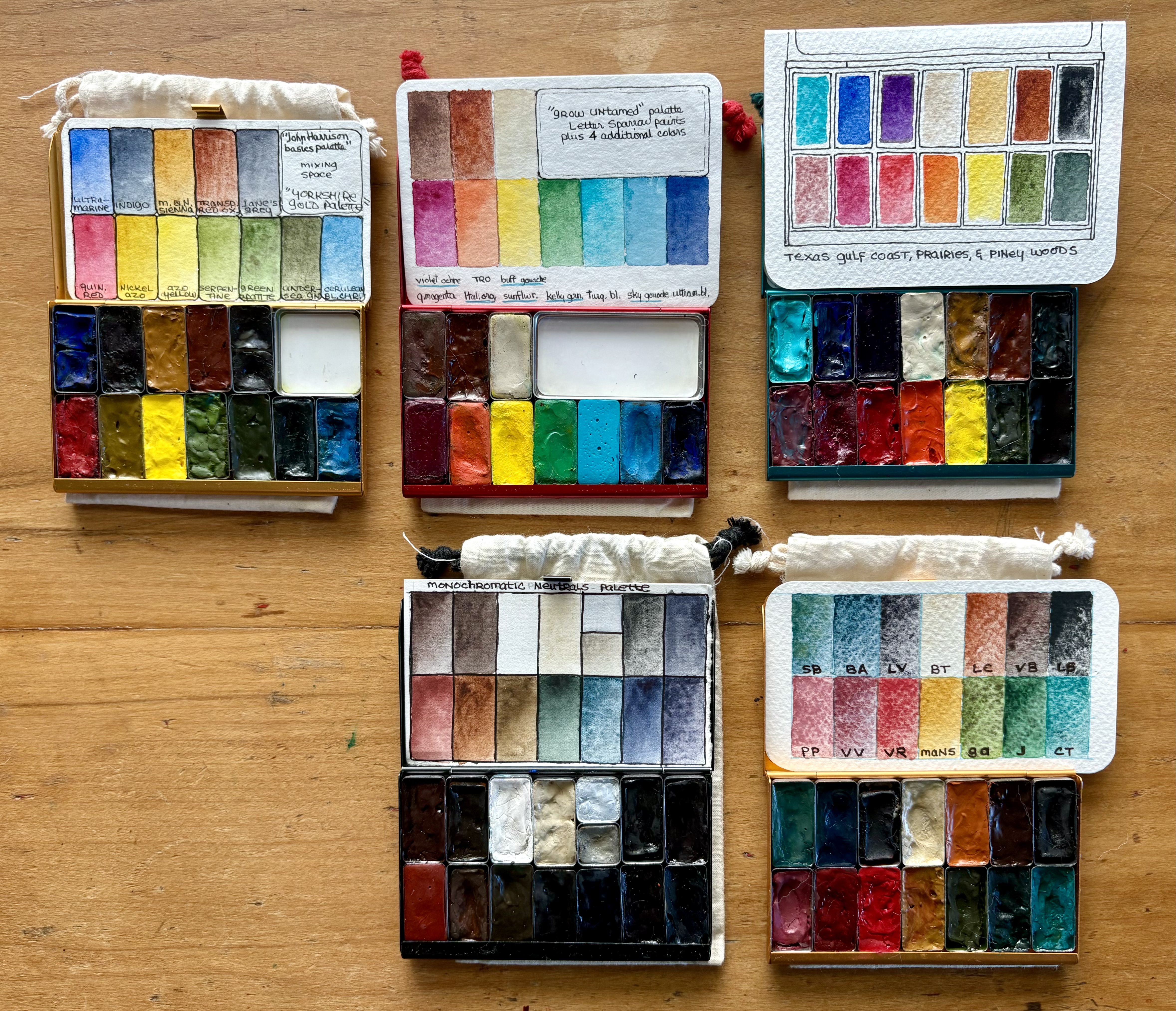
The 2 front pocket palettes in the first photo are the ones I’m currently using for autumn: one of neutrals/monochrome colors and one of granulating pigments. Behind those, there’s one I put together while reading John Harrison’s book, “Pen & Wash” — I like to try out other artists’ color choices as a learning tool. The red palette is the limited edition “Grow Untamed” set with 4 additional colors that I added to the original 6. I put together the turquoise “Texas gulf coast, prairies, & piney woods” after seeing Lisa Spangler set up something similar for a class she taught in Houston. This one gets used a lot!


Next are my Demi Palettes. I love this size especially for trying out limited palettes. From the upper left: the “Rainglow” fluorescent palette (not sure how to use these yet), the “Baby Cactus” set (2 pans have been temporarily moved to the Christmas palette), my “forest” set I like to take camping, the Christmas palette I just put together, and the limited edition CMYK palette.


Next are 2 Folio palettes: one for landscapes inspired by artist Sarah Burns and one of larger pans containing basic colors that lives on my art desk.


Lastly, 2 gouache palettes, which I’ve only played a bit with. The larger one with more colors stays on my art desk and the smaller one travels with me. Like my watercolor palettes, I place colors beginning in the front left in rainbow order, from cool reds to deep blue/purple followed by neutrals.

25 October 2024

lavender’s uses

A few days ago, I posted a sketchbook page telling of a free tube of lavender watercolor that Amazon inadvertently sent me. Many sketchers commented on my Facebook and Instagram accounts with suggestions for how they use this lovely color. 

On this next journal page, I did a few quick thumbnail sketches to remind me of those suggestions.


20 October 2024

free lavender!

This time, a true Monochrome sketch . . . except for that pop of lavender.

I ordered a replacement tube of Nickel Azo Yellow from Amazon; they sent it in one of Daniel Smith’s 3-division boxes and by mistake it included a tube of lavender that I did not order. It’s too much bother for the company to have me return it.

So how do I use this color? It would’ve been good for the far distant Flint Hills of Kansas but we no longer live there.


05 October 2024

one sketch for Inktober


In past years I have had fun joining online sketchers doing one ink drawing a day for the entire month of October. This year I am not participating, but I just refilled my Falcon fountain pen and drew this to celebrate Inktober anyway. My current viruses and strep throat are making me feel a bit foggy, so I added a Demi Palette full of “foggy” colors.

Then as an afterthought, I added some Jelly Babies. They are very soothing to my sore throat right now! Dr. Who #4 would approve.

The Art Toolkit in the second photo is my favorite, an in-between size that is no longer offered. It has my favorite color turquoise trim, and holds just enough supplies while still feeling small in my hands. The footstool is one that Bill made me years ago to go with the Morris chair he also made — Butters has claimed it as her jump-on-the-couch stool so I had to clean Corgi hair off before taking the photo.

Butters has now reclaimed her stool.


22 September 2024

It began with a sticker . . .


This week I am getting a new iPhone, so I ordered a new case. It came with some small stickers, one of which is a corgi camping; I had set up my green Demi Palette for using when camping in the forest and my corgi camps with us — so I added the sticker to the palette.

The forest color card folds out to show some of the mixes from these pigments. I also have an alternate color card should I wish to not include the mixing palette.


Then I remembered a small cactus sticker (I can’t remember where I got it) — and added it to my “Baby Cactus” Demi Palette. 


While I am personalizing palettes, I removed the paints from my Triad Pocket Palette, moving them to another pocket palette. Turquoise / Teal is my favorite color so I moved my most-used colors to this case. These are the colors of our part of Texas, influenced by Lisa Spangler’s Gulf Coast & Texas prairies choices from a few years ago. Originally I put it together as a Demi Palette; the larger size includes two new colors (Schmincke’s Shire Blue & Letter Sparrow’s Black Current) just for fun.


UPDATE: True to my normal habit, as soon as I posted this I made a change in the “Texas” palette! Potter’s Pink is not in Lisa Spangler’s original set that inspired this palette, but she includes an orange and a violet. Since Black Current is similar to Potter’s Pink, I removed the pink and added mini pans of orange and violet.


19 August 2024

new journal, updated sketch kits


Recently I began a new sketchbook journal — at least the first page which shows my full Folio Palette with a few pans of gouache. This time I chose Hahnemuhle’s 100% cotton watercolor book with 120# CP paper, A6 portrait size. Then I reorganized 3 sketch kits . . .


These are what travels with me in my small purse: mini-sketchbook, Demi Palette, tiny pencil, 2 Pigma Micron pens, kneaded eraser, waterbrush, #4 travel brush, a clip to attach palette to sketchbook, paper towel, and water in a contact case (a trick learned from Katharinacreates on Instagram).


I drag this small Art Toolkit around the house for whatever I’m sketching at the moment. Currently it holds 2 Demi Palettes: a limited palette of watercolor and one of gouache. The watercolor palette is switched out for any Pocket Palette depending on mood. It contains a mechanical pencil, gray Pigma Micron, brown fountain pen, white gel pen, waterbrush, small clip, kneaded eraser, tiny turquoise fountain pen, 2 travel brushes, a mini grid card for line spacing, paper towel, and 2 palettes.

My A5 Art Toolkit is loaded for traveling: current sketchbook, Folio palette, masking pen and stick eraser for removing it, mechanical pencil, Pigma Micron pen, white gel pen, parallel fountain pen, waterbrush, paper towel, mini spray bottle, three travel brushes, a Kaweco Liliput fountain pen (not shown) water refill bottle, and collapsible water cup. Also tucked under a flap is a larger waterproof grid card that can help space lines or be clipped to an opposite page to clip paper towel and palette on. 

Fountain pens and palettes are switched out regularly, depending on which ones I currently wish to use. Or to match the season or area we might be traveling to. I prefer using Blackwing pencils so they sometimes replace the mechanical pencils. 

As to traveling plans, more in my next post . . . 🙄

15 August 2024

my current fountain pens

Like nearly all of my sketch journals, the first page showed my current watercolor choices. On this, the final page of this Tumuarta sketchbook, I drew the fountain pens I’m currently using. (I almost forgot to include the Pilot Parallel pen, squeezing it in at the end — and misspelling Parallel while I was at it!)

This sketchbook’s cover seemed rather poorly made, with cardboard covers and the spine left looking undone with only some canvas glued to the book block. But it held up very well. The 140# cold press paper was great to work on, as long as I wasn’t working wet-in-wet — it didn’t seem to like that technique.

01 August 2024

a little “fatty”

Just for fun, I recently bought this chubby wee fountain pen with a fude nib — and it is surprisingly comfortable to sketch with! It has a fude nib but a regular nib is included. It needs no cartridge or converter — the whole barrel holds a huge amount of ink, filled with an eye dropper, also included.

Since it is an eye dropper pen, I rubbed a bit of silicone grease around the threads as an added precaution against leaks. It is filled with a “burnt sienna” ink that I mixed from red and black De Atramentis Document inks.

Also just for fun, I gave this pen a name: “Lugg” for Magersfontein Lugg, who was valet to fictional sleuth Albert Campion. Lugg was once a burglar but “lost his figure”, becoming too fat to burgle any more.

19 June 2024

a Pocket Palette in TEAL!

Inside yesterday’s sketched box? Art Toolkit’s latest limited edition palette, of course. 😁 The deep teal Triad Palette has got to be the most beautiful palette in existence!! I sketched it using a “warm & cool” palette setup currently in my “Grow Untamed” palette because it has two types of turquoise paints. Today at noon Pacific time, Art Toolkit will be having a live demo with co-designer Lisa Spangler exploring the seasonal triad paints and Triad Template included with the new palette.


These are my favorite palettes. The brass colored “Travel & Sketch” folio holds a collection of paints specific to our central Texas location. The deep gold “Drawn to High Places” palette holds my favorite granulating pigments. I removed the handmade paints from the red “Grow Untamed” palette because they were too opaque — maybe I should think of them as gouache instead? In their place, this palette holds a selection of warm and cool pigments plus two neutrals. I filled the extra space with small pans of turquoise, buff titanium, and lunar black.

Another configuration I sometimes use in this red palette is to add a mixing tray that holds 3.2 mm colored pencil leads to fit in a Koh-I-Noor clutch pencil. I got this idea from #rothrockart on Instagram.


Related Posts Plugin for WordPress, Blogger...