Showing posts with label journal. Show all posts

28 April 2026

transition


This past year has been a time of transition in many ways, not just art related. But I actually used my sketch journal as a thoughts journal this week. 🙀

I’ve been exploring muted palettes rather than bright pigments, as well as trying underdrawing with brush pens and adding colored pencils. As I’m nearing the end of this sketchbook and choosing a new one, I’ve slightly tweaked the paint colors and pencils carried in my Mini Sendak. The Pocket Palette holds granulating watercolors and the Demi Palette holds gouache.

Other transitional areas include learning to cope with my “new normal” diet changes following cancer and finding non-medicated ways of dealing with essential tremors in my hands. But as a Julien of Norwich quote I recently found in a Chief Inspector Armand Gamache mystery says, “All shall be well, and all shall be well, and all manner of thing shall be well”.


10 August 2025

last week’s frustrations

Last Wednesday I was dealing with several frustrations, two of which I jotted down on this sketchbook page. And felt so much better after I did! Everything turned out fine in the end, so I wasn’t even going to post it at first. But it’s a reminder to myself not to let frustrations win. Drawing is a much better use of my time.

Our son Jason came after school (he teaches physics) and got my ear pods sorted for me — it seems they were just trying to pair with my MacBook instead of my iPad. 

And Etsy got involved with the damaged gift — one look at the photos and they immediately refunded me themselves. Bill had picked out this antique churn without its tamper as a birthday gift, to be used to hold umbrella, cane, and walking stick. It arrived 3 weeks later than expected, smashed in transit due to the seller not packing it safely. All the way from Norway in only a bit of bubble wrap and brown paper, no box or carton!

26 July 2025

another folded pocket journal


It came as a complete shock when I was chosen as one of three winners in Art Toolkit’s recent Summer Workshop Giveaway! With my love of sketching bits of nature, one of the awarded workshops I chose is “Pollinators in Ink” with Robin Lee Carlson. Her recommended supply list included toned watercolor paper; my current journal has white paper so I decided to make a small pocket journal of toned paper for the workshop and for practicing the learned techniques in further nature studies.


The tutorial for making these pocket journals was presented by Texas artist Judith Dollar and Art Toolkit’s Maria Cornell-Martin last March. The original one shown in the video started with an 11 x 15” piece of paper; I increased this to about a 14 x 18” piece of heavy double-sided wrapping paper. The original journal had an accordion-fold insert of multi-media paper; for this toned paper, I sewed folded papers together using a Coptic stitch. 


The third photo shows the version I made last March, measuring 3 3/4 x 5 1/4”, next to the new one, which is 4 1/2 x 7”. The pocket in front is a great place to stash a Pocket Palette!


26 February 2024

my eye candy

Instead of beginning my new journal with a sketch of one of my Pocket Palettes like I normally do, I just chose my top 18 colors. Which, looking at it this morning, makes me hungry for jelly beans! Gotta love candy colors! 😂 

From the top, the colors are: 

Potters pink (WN), quinacridone rose, quinacridone coral, nickel azo yellow, azo yellow, green apatite, jadeite, cobalt turquoise light (WN), cobalt turquoise, cerulean blue chromium, ultramarine blue (WN), indanthrone blue, monte amiata natural sienna, transparent red oxide, quinacridone burnt scarlet, burnt umber, buff titanium, and lunar black.

All from Daniel Smith except the 3 indicated from Winsor & Newton.


04 May 2023

parting gifts


When I was released from the hospital in early March, I was set up with a lovely home healthcare nurse, Shelli, to monitor my “vitals” at home as well as checking on how we are dealing with the cancer diagnosis. This week, during her final visit, she gave me an unexpected parting gift: a lined journal to write in, a blank sketchbook, and a set of drawing pencils. I guess she got to know me pretty well!

20 April 2023

embracing the wonky

First page of my new sketchbook journal, first sketch done during my first chemotherapy infusion. On handmade 100% cotton paper with uneven sizing. And the drugs seem to make my hands shake — a lot! So, this is officially called my wonky journal. Seems appropriate for my wonky year of battling cancer!

And now that I’m no longer working on a toned paper, I finally get to play with my Christmas gift, the Grow Untamed palette from Art Toolkit! I absolutely love the deep red case and the handmade paints from Letter Sparrow! But I just can’t live without a cool red and turquoise so I added quinacridone magenta and Paris green from Letter Sparrow. Then at the last minute, threw in my regular ultramarine blue and transparent red oxide for rich grays.

My first infusion went very well — until it was finished and the nurse was flushing the port. Suddenly my throat tightened and I was unable to catch my breath, one of the possible side effects. The small cubicle was immediately filled with doctor and nurses, I was given oxygen, and steroid drugs added through the port. Apparently an anaphylactic type allergic reaction to the chemo drug. All turned out well; they will simply need to make adjustments next time to my pre-infusion meds and slow down the infusion time.

Today I feel amazingly well — no nausea (yet!) and the best night sleep that I’ve had in months! Very little discomfort of any kind. But I myself am a bit wonky at walking, back to using a walker. And anything I touch that is cold makes my fingers tingly numb; I can’t drink anything cooler than room temperature either. These are temporary and will clear up. I have been told that chemo is accumulative and symptoms change but so far, so good.


21 December 2021

borrowing other artists’ ideas


Sometimes I scribble ideas in my journal that I find online, usually ideas from other artists of their chosen palettes or sketching setups. I found this very portable setup on Art Toolkit’s 23 November Instagram post, highlighting artist JC Little (@theanimatedwoman). It looks so doable, I jotted it down — and am posting it here in my blog to remember in case I forget which journal it was in.

It uses a small acrylic support with a 2” square ZigZag sketchbook held in place with a Cross Band (available from arttoolkit.com) and magnet clips around the edge holding a Demi Palette, extra mixing pan, and water. The water container is a regular prescription bottle with a quarter attached to the bottom to be held by the magnet. Overall BRILLIANT idea!

Yesterday I received a postcard from Art Toolkit featuring their new Drawn to High Places Pocket Palette, a collaboration with artist Nikki Frumkin. Many of the pigments are not in my stash so I played around with similar ones I do have. It seems strange to not have any earthy neutrals, but I may play around with these colors sometime. I keep a Demi Palette and ZigZag sketchbook in my purse — but with Covid-19, we just don’t go anywhere so it never seems to come out to play!


25 July 2019

another pool day


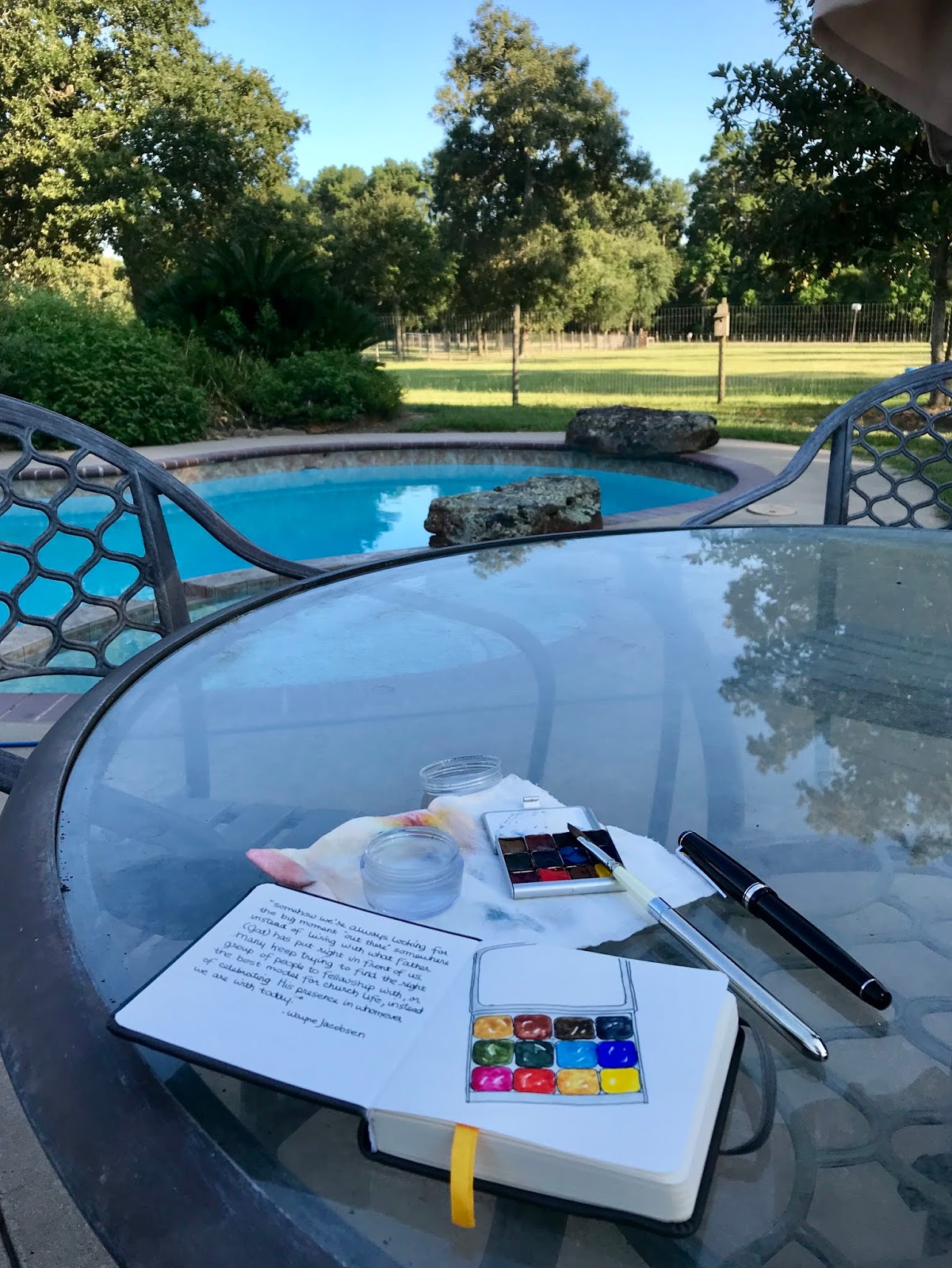
We are spending a couple of days at the new property while grandson Quen visits us. I spent a bit of time outside beginning my newest purse-size sketchbook, a 4” square Field Artist watercolor journal found online. When I painted in the colors of my new Demi Palette, the sun was still so hot that the paint dried a bit streaky. Then I swam and played a bit with Quen in the pool.

By the time I came back to finish and snap some photos, the tall oaks and pines along the west property line cast everything in shade, making these photos a bit blue.

BTW, my earlier post about the Demi Palette included undersea green and green apatite as my two greens. I’ve tweaked that a bit — Mixing a bit of red into green apatite gives a color similar to undersea green, so I switched the undersea green out for the cooler perylene green. Also, instead of my mini waterbrush, I used a travel dagger brush from Rosemary & Co.


10 August 2018

beginning a new purse-sized journal

For years, my normal habit has been to work in only one sketchbook journal, finish it from start to finish, and then move on to the next. Except for short-term interruptions due to a special trip or an online class.

Yet this year, I have juggled multiple journals simultaneously — a class, a vacation, a month-long challenge, and simply wanting something smaller to carry in my purse. Most of my bags have room for the journal size I usually prefer, about 5 1/2 x 8 1/2”, but I tend to change purses quite a lot! Sometimes I just want to carry something tiny and light-weight, and it just seems WRONG to not have a sketchbook with me. Even if I don’t actually do anything in it.


So, even though my current regular journal (a Stillman & Birn Beta softcover) has several more pages to fill, I went ahead and started this new smaller (3 1/2 x 5 1/2”) one to carry with me. The pages are a warm beige tone and the paper lighter weight than I normally work on.


I wasn’t sure how watercolor would look against this beige tone, so I tested both watercolor and gouache. I was pleasantly surprised that both look equally bright! Being lighter paper, I did use less water in my brush — loose washes would probably make the paper cockle.

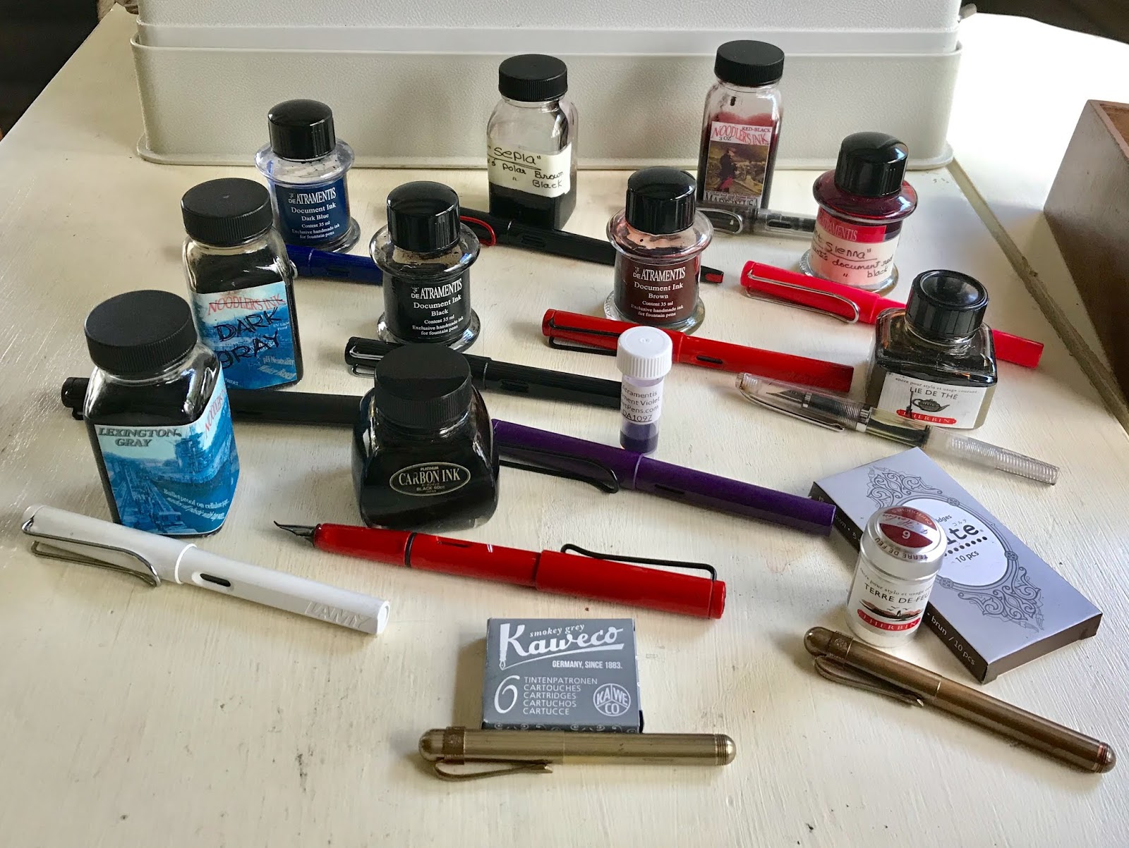
I also tried out several inks to see how the tone affected them, if at all. One big surprise was that J. Herbin Lie de Tie, which is normally a light golden water-soluble brown, appears much darker when washed out on this paper. Also, De Atramentis Document black ink appears as a richer black than Platinum Carbon black.


As long as I had to refill several pens, I decided to take a reference photo of each of my current inks and which pens they are in. I forgot to include my Duke 209 fude pen, which is filled with document black ink. Apparently I also forgot the 2 Kuretake brush pens — the one filled with a diluted Lexington Gray ink will probably be used often on this paper for tonal sketching.

What used to be De Atramentis Document red ink has been altered to my own blend of “burnt sienna” ink by simply adding a few drops of Document black ink to the red. The “sepia” is a blend of leftover Noodler’s polar black and polar brown. The dark gray is the result of several inks; whenever it’s used up, I probably won’t replace it. The same goes for the Noodler’s red-black and the De Atramentis dark blue — I just don’t use them enough to warrant replacing.

14 February 2018

beginning a new journal


As with all of my journals, I added my current palette to the first page of my new journal, a Stillman and Birn Beta softcover. The heavier Beta paper is my favorite of this brand’s excellent product line, with its brighter white cold press surface.The watercolors on the right-hand page are my up-dated choices, along with my favorite fountain pen, a Kaweco Liliput XF.

I read the quote from Cathy Johnson recently on her Facebook page and it stuck with me. Beware what you write on blogs and social media — it might find its way into some sketchbook artist’s journal!

The tube watercolors are squeezed into various sizes of metal pans borrowed from my Pocket Palette, from Expeditionary Art. Two business card sized magnets were attached to the bottom of this flat metal Daler Rowney palette box I once found at a Target store in the scrapbooking section. I can play around with the paint arrangement, and there is space at the bottom for both a travel squirrel mop brush and my Liliput pen.

But another arrangement I can switch to, especially if I find myself using toned papers, is to add a row of gouache along the upper edge. Just a basic triad plus white; I can mix just about any color from these, or mix them with the watercolors. I added the gouache colors to the upper left of the first page spread, after deciding to have this option.

I carry a waterbrush that can be used with the gouache, as I think the pigments might be hard on the squirrel or sable travel brushes I carry with me.

20 November 2012

a new beginning

I've started a new sketchbook, with cleaned up palette and re-filled watercolor pans . . .

This handbound journal contains mostly Fabriano Artistico 140# hot press paper, plus a sample of Canson Dual 140# (cold press on one side, rough on the other). In the binding process, I forgot to add end papers . . . and found that I actually prefer it this way, using the same watercolor paper for end paper as well.

Though I'm no longer limiting myself to 3 primaries + 2 neutrals, I have larger pans of them in this palette. But I dropped Payne's Grey, switching to Monte Amiata Natural Sienna as my second neutral --- mixed grays and blacks are so much more interesting.

11 June 2012

Ceilidh on the job

Having a recent problem with vertigo, I've been spending a lot of boring time laying still in bed. Better than the world spinning around me, I guess. We rigged up a way for my very short Scottie to get up on the bed with me if she wants to by moving an ottoman in from the living room.


I also used my journal to record when each attack of vertigo happened as well as the current meds I'm taking to lessen the effects. It will be helpful this morning when I go in for an MRI.

06 January 2012

urban sketch -- watercolor on Niddigan paper

After reading lots of comments here and on my blogs re: the Niddigan paper in my new journal, I found I could indeed paint on both sides without any bleed-through, and that watercolor works as well as gouache.

Yesterday was sunny with no wind (a rare thing in Kansas), so I sat out on the stoop in front of our porch, sketching what was in front of me. A rusty old vehicle. It was thought to be abandoned, but apparently someone still drives it once in a while.

Another challenge for the new year -- I've decided to go through an entire journal using only the palette(s) pictured on the first page(s). Haven't done that before (I'm a bit crazy). I'll try it with both this Niddigan journal and the WC Moleskine in my purse. Maybe become a bit more disciplined?

11 December 2010

Visual Journal in old planner

Life has been busy lately . . . normal for this season's preparations. I haven't had much sketching time. This journal spread was from Wednesday's prayer meeting, but I hadn't had time to post it.

Lately it seems easier to carry my sketch journal inside this old Franklin-Covey planner cover than to carry a purse. There are pockets to tuck an ID, credit card etc. I can just slide my current journal into the pocket where the calendar section used to go.

The watercolor palette is an idea borrowed from Cathy 'Kate' Johnson --- a Neocolor II watercolor crayon tin, spray-painted inside with white enamel, and outfitted with the basics. My tin is a bit larger than Kate's, having come with 15 crayons instead of 10. But it still fits in the back zipper pocket of the planner cover.

The WC pans are attached with rubber cement; if I wished to, they could be removed and the WC crayons put back in --- painting the inside cover white makes a handy mixing area for them as well.

You can see more on Kate's tin by clicking on the following links:
outside tin
attaching WC pans with rubber cement
an early assembling of tools

For more on my using this old planner cover, you can click here.

21 June 2010

back to exercises


Things have calmed down somewhat around here; last night I painted another exercise from "30-Minute Landscapes" by Paul Talbot-Greaves.

I'm hoping that doing the exercises in this little workbook will help me paint with more confidence when painting "en plein air".

03 May 2010

Kenny & Ziggy's


LOL! From glancing through this small sketch journal, one would think that I've done nothing in Texas except eat out and go to church!

Actually, that is what ends up in this one because it fits in my bag so easily, ready to pull out when I get a chance to sit down somewhere. When shopping or going other places, I'm just on the move too much to sketch.

On Mother's Day, I will be in the north part of Houston taking care of my older granddaughter, Mikala, while her parents are in Las Vegas. So Jason & Carrie took me out to celebrate this weekend instead. I wanted to check out some shops in Rice Village.

Later, we met up with Carrie's parents to eat at Kenny & Ziggy's, a well-known deli in Houston. Great food and great time together . . . her mom and dad are awesome friends!

22 March 2010

Shabbat, 20 March


Our son, Jason, and his family belong to a wonderful Messianic Jewish congregation in Houston, Texas. Whenever I visit this church, it's like coming home.

The congregation is of an international flavor; the worship a blend of ancient Jewish traditions and contemporary Christian praise & worship. (Who knew that a shofar could actually produce such sweet music?!) I especially love the traditional Jewish praise dance -- so sweet to see grandparents, teenagers, and tiny pre-schoolers all holding hands and going through the ancient steps together.

The revered Torah scrolls in the sketch are in fragile condition; according to normal practice they should have been replaced long ago. But how do you replace such history? These were lovingly hidden between newspapers and smuggled out of Hitler's Germany, to be gently put back together once they were in safer lands.

15 March 2010

Sunday's journal page

Mikala and son-in-law Michael are visiting KS during spring break; we had a delightful time with Mikala on Sunday. (Our daughter, Kristen, is on a church mission trip in Romania).

I recently found some candy Lego blocks -- they made a BIG hit with Mikala. We still don't know what they taste like though; she wasn't sharing! Had to build first. I wish I had sketched some of them.

After taking her back to her other grandparents, I finished knitting a beret and sweater for her birthday bear. Not wanting to take the pattern book with me to TX, I went ahead and knit them, then will sew up seams later.

21 January 2010

playing in my journal, 20 Jan.


I drew this cross from a photo found inside an old Eden's Bridge CD.

I've long been fascinated with Celtic crosses. Seemed a good excuse to try another of Daniel Smith's iridescent watercolors -- this one is duochrome desert bronze. I also used a bit of burnt sienna and sepia.

(The quote is from a book I am currently reading; I often scribble down thoughts I want to remember in my art journal.)
Related Posts Plugin for WordPress, Blogger...