Showing posts with label folio palette. Show all posts

29 July 2026

new palette colors


Recently I watched a YouTube video from Natasha Newton of her current favorite art supplies, including the “Elements” palette of handmade watercolors from A. Gallo. I love the combination of colors but (a) I prefer using Art Toolkit magnetic palettes and (b) I already own so many tubes of paint!

So I put together this Folio palette with paints I already have. Six of the pans of color, I created by mixing two tubes of paint directly in the pans using a toothpick to stir. I can see that I needed more green gold in the warm green, more shire blue in the cool green (jadeite is a very strong pigment), and some blue in the cooler gray. But they’ll be fun to play with as is.

The birds were seen on our front porch, at one of the feeders and perched on the arm of a rocking chair. There was only one titmouse; I drew him in two poses.


This is the page of notes I jotted down, listing the original A. Gallo pigments plus which of my existing colors came closest in color match.

18 June 2026

relaxing with watercolor


Yesterday evening I set out to pay a few bills online. I pulled up a recording of a recent Zoom painting session on Patreon hosted by Natasha Newton, planning on just listening in. But instead found myself grabbing masking tape, watercolors, and brushes and joining in with the participants.

The bills got paid later.


07 June 2026

a simple garter stitch


A doctor once told me that knitting might strengthen my hands, giving me a bit more control over my benign tremor. I enjoy knitting but our warm, humid climate makes sweaters or afghans out of the question. So I’m knitting cotton dishcloths.

Just a simple ink & wash as I enjoy a mug of tea . . .


21 May 2026

prickly poppy

Bluebonnets get the most attention of the vast variety of Texas wildflowers, but my personal favorite is the Prickly Poppy. It begins blooming in mid spring and lasts through late summer’s heat, a bright pop of white in the green pastures and along roadsides. I drew these from a photo taken at our campsite in Bastrop State Park. I especially liked how the flowers looked next to the Bastrop ironstone.

State Farm acted quickly after our car wreck two weeks ago. We received our claim payoff and yesterday we were able to buy another Trax, this time in a new color called “cypress gray” — in some light it looks dark earthy green and some light it looks gray. Once we add a tow package, we can get back to camping adventures.


20 February 2026

camping at Cagle


This week we have been once again camping in the Sam Houston National Forest. Not too hot, not too cold — just right for leisurely walks on nearby trails. There are several items we forgot to pack or didn’t think we’d need and wish we had, but it’s been a relaxing, enjoyable time. Today, lots of new campers are coming in for the weekend just as we are getting ready to head home. Being retired means not needing to plan around working hours!

At the campsite next to ours, we found an arrow made of pine cones, leading up to a hidden painted rock that someone left as a surprise. I took a photo and left it for the next person to find.


06 December 2025

tweaked yet again

One could say that I’m obsessed with the flexibility of these palettes. After using two separate pocket palettes in my mini Sendak, one watercolor and one gouache,  I decided that one large folio works better for me. But how to combine watercolor and gouache in a useable way?

This is what I came up with upon returning home from our camping trip yesterday. The watercolor pans are placed horizontally and gouache pans are vertical — all except that perylene black gouache but its placement was unavoidable. I’m trying to keep color groups together.

UPDATE: the Transparent Red Oxide watercolor was supposed to be a brownish color but it was too similar to the Venetian Red. So I replaced it with Lunar Earth. Being transparent, I was able to lift it with a wet stiff brush and tissue before applying the new paint choice.

17 November 2025

tweaked again!


And of course, I have tweaked my new combo palette! I missed the lovely Ash Blue gouache. And living in this sunny climate, a brighter yellow might be needed — Titanium Gold Ochre is still muted, sort of like Naples Yellow. I removed the Sepia watercolor, as I can achieve its granulating brown by mixing “Random Grey” watercolor with Smoked Bamboo gouache. 

I also moved all the “browns” to one side of the mixing pan and all of the “greys” to the other — though Zoisite Genuine watercolor is more of a dark green.

Random Grey was my attempt at copying Schmincke’s one-time issue of a random grey that was a mixture of unknown pigments that will not be repeated. I stirred together Ultramarine Blue, Transparent Red Oxide, and Burnt Umber for its brownish grey tone. A spot of a cool red might have improved it.

The “Pale Green” should be a bit greener in color. I made it by stirring a bit of Perylene Black (which is a dark cool green) into Titanium White. My mixture of “Jane’s Grey” (or Payne’s Grey) could use a bit more Ultramarine to it.

By the way, the R20 short flat travel brush from Rosemary & Co has become one of my favorite brushes. My other favorites are the R13 #8 sable blend round, the R19 #12 pointed round, and a funny little flat brush from Herend.

16 November 2025

tiny sketch challenge, done!


Leslie Stroz, an artist in the UK that I follow, began a “100 Tiny Treasures” art challenge earlier this year to create 100 tiny paintings during 2025. I decided to do 50 instead — less pressure and that’s all that would fit in my tin box! Today I did my 50th painting, the Nuthatch in the above group, from a photo prompt Leslie posted on her Patreon site.


The second photo shows the whole pile of my tiny sketches, and the third photo shows them inside my favorite plaid tin (yes, the lid will actually close if I place them in neatly). Many were done during short camping trips and hold special memories. My favorite has to be the one of my Corgi, Butters.  


I painted the Nuthatch in a different technique that I’m beginning to play around with. No ink lines; I used both watercolor and gouache from my large gold Folio palette (a Travel & Sketch palette from Traveler’s Company USA) and just a touch here and there with a colored pencil.

When I recently put the muted gouache & watercolor combo palette together, I mixed several of the colors myself right in the pans with a toothpick. I want to try painting directly with these colors with very little pre-mixing of colors except where they naturally mix on the paper.

I also splurged on a new gold Demi palette from Art Toolkit’ Christmas collection and filled it with gouache as a tiny companion to the Folio palette that I can carry with me when we are away from home.


08 November 2025

tweaking palettes, charting pencils


This week I’ve been changing out some palettes, both watercolor & gouache, and digging out my colored pencils. It began with placing every pan of gouache I own into a Folio palette, and making a color chart of them. Many are pans that will not be replaced when they are used up — eventually making room for adding a large mixing pan to the folio palette.

I want to do more mixed media sketching which called for gathering my colored pencils, most of which are watercolor pencils. I have never made a color chart of them before.

I’ve always loved muted, earthy colors most. Yet usually I put palettes together that included classic bright primaries — but why? If muted colors are my favorites, why not stick to them? So the two pocket palettes are both muted colors, one watercolor and one gouache. Maybe I should make a color chart of my small set of Neocolor II crayons as well? 


20 October 2025

new toys


I love to draw. I have since early childhood. For many years now, I have sketched in an illustrative style, matching colors to whatever objects or scenes I’m trying to depict and trying to make whatever it is look “real”.

But recently I’ve been inspired by the art of Natasha Newton to get out of my comfort zone and try something new. Instead of ink lines and transparent watercolor, use more multi-media — a base of either watercolor or gouache followed by colored pencils or Neocolor II crayons. Maybe a bit more “folksy” in style (if I can break out of my realism tendencies). Not working so much at mixing colors, but using them “straight” (even gouache) and adding a few pencil details on top.

Not sure where I might go with this but I hope to loosen up and have some fun.

The folio palette above shows all the gouache I’ve collected over the years, plus a few recent additions. (One empty pan is waiting for Dick Blick to send the tube of elm green they left out of my order). I’ve played around with gouache over the years but haven’t posted much of it, not sure what I was doing.

The unusual colors in the smaller palette are similar to one in Natasha’s small travel kit, which includes a lot of colored pencils and some fine liners. Four of them, I mixed myself from other paints I already had.


11 October 2025

palette revamping


Today I was busy baking sourdough bread and cleaning these two palettes, so just a very quick ink sketch. I was liking the way it was turning out in black & white — until I added those stupid shadows. Oh, well . . . Tomorrow is another sketch.

15 September 2025

wild sunflowers


With all that’s been going on with us in the past few weeks, our bird feeders have been sadly neglected — I found this rogue sunflower growing underneath one of the feeders.

So far, I have only used Neocolor II watercolor crayons in this small nature journal I made (Ink lines are done with a Pentel Pocketbrush pen). Today, I tried regular watercolor to see how a more watery color looks on the toned paper.


12 September 2025

a wee visitor

Today’s tiny sketch is from a photo taken last week. As I climbed into bed, I noticed this bright orange lizard climbing the wall. Our cats, Bardie and Scottie, were busy chasing tiny gnats they could hardly see yet they were completely oblivious to this 4” lizard just a few feet away. I’m sure he was laughing at them.

30 August 2025

simplifying

While my other Folio palette now holds a standard sized pan of every granulating watercolor I currently own (30 of them!), I reconfigured this Folio for simplification. Both of the large palettes live on my art desk. I decided to try this one with just a limited palette in double pans arranged around mixing pans — similarly to how I arrange mini pans in a Demi palette.

As much as I love unusual pigments, it would make an interesting challenge to stick to only 9 colors. Two of those I included are new to me: cobalt blue and moonglow. Just giving them a try for now. Normally I would have cerulean blue chromium instead of cobalt blue.

From the lower left working around, the paints are quinacridone rose, hansa yellow medium, green apatite, cobalt blue, ultramarine blue, moonglow, monte amiata natural sienna, transparent red oxide, and burnt umber — all from Daniel Smith.

Here’s a look at my other Folio palette filled with granulating watercolors. I am not a paid representative for Art Toolkit, who makes these palettes — I just love their versatility and compactness! All sizes of pocket palettes can be found by clicking HERE.


23 July 2025

granulating pigments


The pocket palette that I have been using recently (in the upper right corner) held 14 granulating watercolors. But I remembered that I had others that are listed as granulating, some more so than others. Many were remaining pans of colors I no longer have tubes for; that quinacridone gold is one of 2 pans I still have of the original discontinued formula. Others are from small sample tubes.

I wondered if they would all fit in one folio palette — and they pretty much do! I left out hematite genuine (I’m not too crazy about it), bronzite genuine (which has a bit of sparkle to it), and a couple of experimental pans I mixed myself of pigments used in the Schminke Super Granulating line of paints.

The cobalt blue is new to me. The guy that taught me about watercolor included it in his palette of 12 colors. At the time, I used Cotman student grade paints and I didn’t see much difference between cobalt and ultramarine. This week I bought a small tube from Daniel Smith just to give it another try.

I think I’ll keep these stored in the folio pan, removing only those I want to use in smaller palettes for various projects. 


This color chart was also an exercise in precision for me. For several years, I have experienced a slight uncontrollable shaking in my dominate right hand. Not all the time and not predictable. Later this month, I’ll be seeing a doctor to try and figure out what it is. But for today, slowly painting out these rectangles was a good practice in keeping my hand steady. Sometimes concentrating helps.


13 July 2025

packing essentials


Today we have been loading the RV for another week of camping, this time heading back to a site along the shore of Lake Conroe. I drew the art tools I planned to pack but it did not turn out as I had planned. Oh, well . . .

After gathering everything together, I thought “why carry both pocket palette and demi palette when all would fit in that empty folio palette?” So I temporarily moved all the paint into the folio for this trip.


Here’s a close up of the paints from the demi palette for those curious. This is what I currently carry in my bag for tiny sketches.


22 April 2025

on breaking rules


When it comes to sketching, I do not play by the “rules” followed by so many sketchbook artists. I seldom sketch on location (allergies to seasonal stuff and insect bites get in the way); in fact I often sketch from photos (😱) I take with my phone. I seem to never finish a sketch from beginning to end all in one go — the above sketch has been worked in bits and pieces over a week. I never sketch in public places like coffee houses because I am a happy little hermit who loves it here in the country. 

My palette is always changing! When I was first introduced to watercolor 20 years ago, I used the palette of 12 colors that my teacher, John Lokke, used. Great and versatile choices, but it’s so much fun to try new ones! My preference leans towards single, transparent pigments but there is often a form of opaque white included. There are usually several tube greens, though they may be tweaked with other colors, and I don’t always mix my own black. Many times I grab a waterbrush instead of really nice brushes because it’s quick and easy.

Though I have completed several large paintings that hang on the wall, and for a time sold sketches on Etsy, I much prefer simply drawing line and wash bits in my sketchbook — common things that reflect my day or things that capture my interest. (And yes, I draw my art tools a lot simply because I want to.)

I have worked directly in ink many times but usually use a pencil to lightly draw my subject first. Changes might be made when adding ink lines and the lines don’t necessarily follow the pencil layout — I tend to make it up as I go along. Pencil lines are usually erased before adding watercolor . . . if I remember to. Many times, some bit of text is written in ink when the idea of a sketch is only a few pencil lines — my sketchbooks are more like personal illustrated diaries.

But apart from sketchbooks, I’m having fun with tiny sketches that serve no purpose and are kept loose in a small tin box. I found a very small clipboard on Etsy that helps hold on to the piece while working, sold by bluestarcraftsmx who has designed a lot of cool sketching items. My Kaweco Liliput fountain pen fits the front loop perfectly. This particular pen has an extra fine nib and is filled with a subtle gray ink that works well in tiny work.


22 February 2025

palette play


Lately I’ve been doing a lot more reading (with a hot cup of tea — it’s cold out there!) and less sketching, but I managed to play around with some palettes inspired by other artists. I even bought a few new colors to try out (especially when found in smaller sample-size 5ml tubes). If I already had a similar color, I made substitutions. This is one reason I love collecting Art Toolkit palettes so much — it’s easy to switch out the magnetized pans whenever I get a whim to try a different combination!


The first palette shown is inspired by Jill Gustavis (seen here). I love her idea of sky colors above, earthy colors below. My substitutes include cerulean blue chromium, potter’s pink, volcano red, quin. magenta, nickel azo yellow, and raw umber.

The next set from Robin Lee Carlson (find her work here) includes fuchsite genuine, a subtle green that intrigues me. I especially love Robin’s nature studies! I substituted quin. red.

The third set was found several years ago on The Animated Woman’s Instagram account, when she was sketching with a water-soluble Elegant Writer calligraphy pen. These colors compliment the colors that can be bled out with a damp brush. The colors look wintery to me, to go along with these colder-than-normal days.

15 December 2024

new sketchbook, random bits


Over the past week, I added a bit here and there to the first pages of my new sketchbook. Eclectic and unplanned. The paints I put together in this “landscape” palette include several colors I’ve never used before.


19 November 2024

my palette collection


A follower on Instagram asked if I would do a post about my Art Toolkit palette collection, so I took photos of each of them this morning. Do I need more than one watercolor palette? Of course not!

When we downsized 10 years ago to an 800 square ft. living space, I gave away many things that I used to collect. Palettes are something I can collect and enjoy that take up very little space. Besides, it’s fun to put together various combinations (always subject to change 😂).

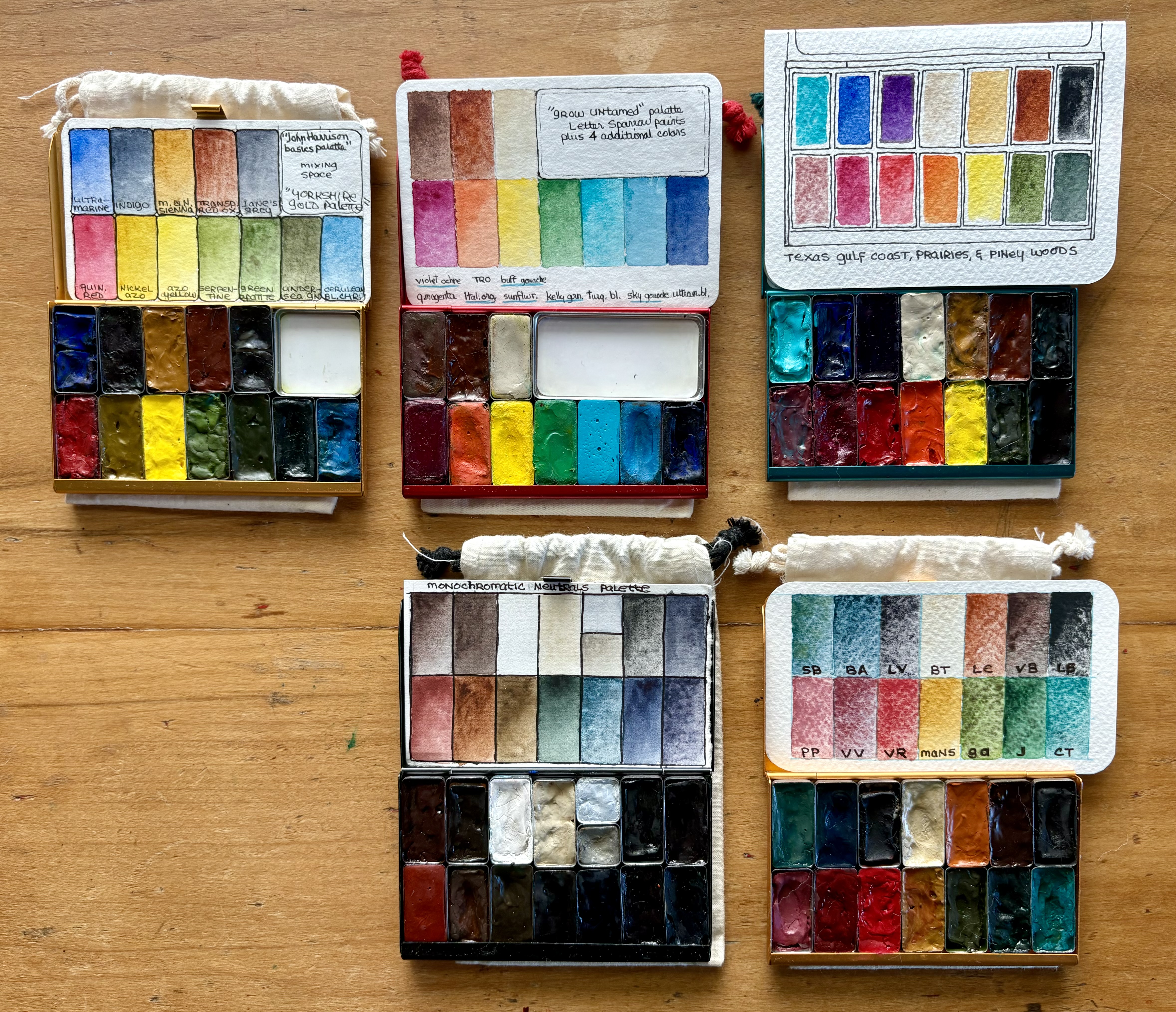
The 2 front pocket palettes in the first photo are the ones I’m currently using for autumn: one of neutrals/monochrome colors and one of granulating pigments. Behind those, there’s one I put together while reading John Harrison’s book, “Pen & Wash” — I like to try out other artists’ color choices as a learning tool. The red palette is the limited edition “Grow Untamed” set with 4 additional colors that I added to the original 6. I put together the turquoise “Texas gulf coast, prairies, & piney woods” after seeing Lisa Spangler set up something similar for a class she taught in Houston. This one gets used a lot!


Next are my Demi Palettes. I love this size especially for trying out limited palettes. From the upper left: the “Rainglow” fluorescent palette (not sure how to use these yet), the “Baby Cactus” set (2 pans have been temporarily moved to the Christmas palette), my “forest” set I like to take camping, the Christmas palette I just put together, and the limited edition CMYK palette.


Next are 2 Folio palettes: one for landscapes inspired by artist Sarah Burns and one of larger pans containing basic colors that lives on my art desk.


Lastly, 2 gouache palettes, which I’ve only played a bit with. The larger one with more colors stays on my art desk and the smaller one travels with me. Like my watercolor palettes, I place colors beginning in the front left in rainbow order, from cool reds to deep blue/purple followed by neutrals.
Related Posts Plugin for WordPress, Blogger...