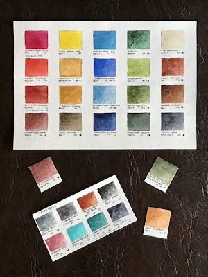
Maybe it’s the “mid-winter blahs” but I was feeling a bit bored yesterday . . . so I started playing around with my current sketching palette. It was based on ultramarine blue and burnt umber for mixing various grays, plus a bright primary (quinacridone red, quinacridone gold, and the ultramarine). I also added an earth primary (piemontite genuine, monte amiata natural sienna, and cobalt turquoise) and potter’s pink (all are from Daniel Smith).
Yesterday I tried making some changes to the earth triad, starting with the turquoise — an old leftover pan of manganese blue hue, which looked a bit “icy”, and raw sienna because it’s a bigger difference from quin. gold.
I like piemontite but it didn’t mix very good orange tones so I compared other earth reds: quinacridone burnt scarlet (too autumn-like; I was after “winter”) and lunar red earth. Then I came across an old pan where I had mixed the last of a tube of Indian red with lunar red earth. They are both PR101, but I hadn’t liked the heavier opacity of Indian red. Somehow, mixing the two together made a slightly more transparent version that makes a better orange so that’s what I decided to use.
Then, since I’m not sketching people (potter’s pink is great for flesh tones), I exchanged it for undersea green just for fun. It may be winter but we are still mostly green here in Texas.


