31 December 2019

testing turquoise watercolor


With all the extra busyness of this time of year (with the added task of interviewing new realtors), my testing of turquoise watercolor paints got sidetracked. Until recently, the only turquoise I had was Winsor & Newton cobalt turquoise light (Daniel Smith calls this pigment cobalt teal blue). Though this color is the perfect match for the swimming pool, as in the sketch below, it’s just too pale for me. I’ve had this small sample of the color for years and found very little use for it.


But this year I have been very drawn to the color turquoise. In fact, that’s an accent color I want for our new barndominium, whenever we actually get it built. With all that lovely wood interior, turquoise just seems to fit. (Our couch and my favorite Morris chair are upholstered in brown fake leather; perhaps I’ll add a small southwestern pattern rug with turquoise in it? And maybe a touch of turquoise in the kitchen backsplash?) Hence my quest for the “right” turquoise watercolor paint to add to my new palette configuration as one of my 4 “just for fun” colors.

Daniel Smith’s phthalo turquoise is a gorgeous deep teal and when I found it, I thought it was The One. But then I tried cobalt turquoise — such wonderful granulation! And it is one of the two pigments used in the phthalo turquoise; by adding a touch of phthalo blue, I can still get that deep teal. So I think cobalt turquoise wins!

30 December 2019

at the Mango Tree

From a couple of weeks ago . . .

We had a quick lunch with our daughter Kristen at her favorite neighborhood Thai / Asian restaurant, The Mango Tree.

I loved the delicate Depression glass tea cup they served my tea in, as well as the chosen flavor (Numi Organics Aged Earl Grey). And the peanut sauce on the salad was amazing!

26 December 2019

Christmas Eve bits


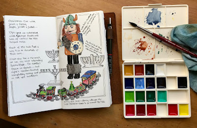
We drove to Beasley on Christmas Eve for dinner with our oldest son Jason and his family. I began sketching bits here and there as I chatted with grandkids — until pulled away for a couple hands of Uno. We went to our daughter Kristen’s house in Houston on Christmas Day (where we learned a new Mexican Train Domino game) so I didn’t get back to finishing these sketches until this morning. Allowing me to use my new Japanese Kissho Gansai watercolors instead of my purse pocket palette. They are wonderful to mix and paint with!

19 December 2019

that forgotten sketch . . . finally


A couple of weeks ago I was sitting by the side of the pool, sketching this scene looking to the east. (That red barn in the distance to the right will someday be our new home.) Though the water was too cold to swim, the sun shone brightly and there wasn’t any wind — it was a lovely afternoon here in Hockley, Texas! But we needed to go somewhere so I put my journal away, planning to return to finish the sketch the following day.

Okay, the next day didn’t happen, nor did the day after that. It finally turned cold and we have had more than the normal amount of errands to be run, with our log cabin going temporarily off-market while we interview new realtors. I moved forward in my journal but left this sketch unfinished. Yesterday I finished it inside, out of the bitter cold wind! The pool is still lovely to look at (at least it is after scooping the leaves out!) but it is just too cold to sit out there this week.

17 December 2019

which turquoise?


Although turquoise has never been in my regular palette of colors, except for one tube of Sleeping Beauty Turquoise Genuine (a Daniel Smith Primatek paint) that I tried years ago — it dried up hard in the tube before it was used much. I’ve tried Winsor & Newton’s Cobalt Turquoise Light off and on but haven’t found reason to use it much before.

But lately I have fallen in love with turquoise and teal as colors and wish to have one really good one as an “extra, just for fun” color. Years ago I filled a ring binder with the sample sheet dots from Daniel Smith, so I’m checking out their turquoise options.


Their Cobalt Teal Blue is the same pigment as my Cobalt Turquoise Light (PG50) — a bit on the pale side, though it is exactly the color of the swimming pool. I have a tube of Phthalo Turquoise  (phthalo blue + phthalo green but more convenient) — love its deep teal color!

But I’m really leaning towards Cobalt Turquoise  (PB36) — wonderful granulation!

16 December 2019

a bit of church sketching

Too much running around running errands, looking at fireplace stone tiles, and lining up new realtors — not much sketching getting done.

But there’s always a bit of time to draw while listening to Pastor David in church.

J. Herbin Terre De Feu ink in Kaweco Liliput fountain pen.

13 December 2019

an early gift


After watching Teoh Yi Chie’s comparison video of two popular Japanese watercolor paint brands, I wished to try some for myself. The plastic box of handmade Kissho Gansai arrived this week (I found them on eBay) and I immediately painted out color samples in my sketchbook.

The above sketch shows the order they came in, as well as the stock number and Japanese name. In the pan, it’s hard to tell what color some of them are. My high school art teacher, Annie Lowery, was Japanese — I sure could’ve used her help! Sadly she passed away . . . on the very same day I visited a watercolor group for the first time and renewed an interest in art after ignoring it for 33 years. I always thought the timing a bit weird.

My first impression is how much more transparent they seem than Teoh described. True, they are just a bit towards the opaque side, but still very clear and bright. My second impression: the paint picks up very easily without needing to spritz the pans first with a spray bottle.


The colors aren’t so very different from what I’m used to, though I don’t have any way of knowing what pigments are used. I set them in my old “rainbow followed by neutrals” order — I can now see that one of those darks is an “indigo” and needs to be moved next to the blues. Maybe that “earth yellow” should be moved next to the bright yellow instead of with the neutrals?

I’ll have fun playing with them, especially for painting Etegami with a large Japanese brush, but after they are used up I plan on refilling with my regular paints as it would be difficult to find refills of Gansai. The layout of the plastic palette fits my new “4 primaries + extras” arrangement and I love the palette itself. Which might be the real reason I wanted to try these in the first place.


12 December 2019

strategizing

I’ve been a bit lax in posting recent sketches . . . Our realty contract on the cabin expires today and we’ve been seeking suggestions on where to go from here. Properties meant to be weekend / vacation homes typically sell best in early spring and we missed that window.

Before meeting with our current realtor Monday, we tried a new restaurant in Brenham, Las Americas. Very good food and a lovely staff.

And there’s a snow globe to play with on each table!

06 December 2019

yet another iPhone card


With my recent post about switching my studio palette from “rainbow order” to a grouping of 4 different “primaries + green + neutral”, I guess it’s inevitable that the card in the back of my phone case reflect the change as well.

I actually started a sketch outside, sitting next to the pool enjoying the sunshiny day — that was 2 days ago! I was distracted by other things that needed doing and places we needed to go and appointments to be kept.

Isn’t that how it normally goes? Perhaps I’ll get back to that poolside sketch tomorrow. After a trip to check out a tile store in Houston and a meet-up with our daughter and a wee bit of gift shopping . . .

01 December 2019

studio palette, reorganized


Since I first began playing with watercolor in 2005, I have arranged my chosen colors in “rainbow order”. Pigments have come and gone, but the order always ran from cool reds to warm blues or violets, followed by neutrals running from lights to darks. (Maybe because my mother’s family is related to Sir Isaac Newton who explored the colors of the rainbow?)

A few years ago I saw one of Jane Blundell’s palettes arranged in four rows of primaries plus greens and neutrals. The image stuck with me — so I finally switched my studio palette to a similar pattern. Those three pans on the far right are just extra colors for fun.

This large metal Schminke paint box came with dividers to hold the pans of paint; I removed them, freeing the space up for whatever configurations I choose. At first I attached pans with rubber cement, then I switched to blu-tac. Now I have attached flat magnets to each pan bottom. (I gave away most of the Schminke paints; I prefer Daniel Smith.)

The lines of the ink sketch are very wonky but that made it more fun to draw. There’s actually plenty of room — I may move the pans close together to make room for my most used brushes.

My choice of colors from top to bottom of each column:

REDS: quinacridone rose, pyrrol scarlet, quin. burnt scarlet, lunar red rock
YELLOWS: Hansa yellow medium, quin. gold, monte amiata natural sienna, raw umber
GREENS: Prussian green, serpentine, green apatite, perylene green
BLUES: phthalo blue GS, ultramarine, cerulean blue, indigo
NEUTRALS: grey of grey, buff titanium, burnt sienna, Jane’s grey

EXTRAS: cobalt turquoise light, phthalo turquoise, carbazole violet
I may add potter’s pink to these “just for fun” colors.

30 November 2019

Mexican plum tree color

I’ve been very slow at finishing this journal page . . . ‘‘Tis the season for procrastinating!

While at the cabin this past week, I found that the recent hard freeze (unusual for this area) had caused the leaves on the Mexican plum trees to become quite colorful.

27 November 2019

new journal, partly bound


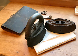
My next sketchbook journal is only partly put together. This leather cover is meant to hold refillable traveler’s diary pages, with elastic bands holding folded folios together. I folded pages of Fabriano Artistico and Stonehenge 150# watercolor papers, sewing them together as I normally do. But instead of making a cover for it now, I’m putting the book block in this leather cover while I fill it. After the pages are filled, I’ll make a permanent cover for it.

After folding papers and creasing the folds, I like to let them sit under these antique irons for a few days. They once belonged to Bill’s grandmother.

The leather cover came with a binder clip and pen loop, but my regular fountain pens don’t fit in the pen loop. My Kaweco Liliput fountain pen does fit though!

The elastic band holding the journal closed is built in.
As per usual, I added a watercolor palette to the first page — but instead of sketching one of my palettes or a few pens, I painted random dots of the colors I’m using in this book.

For years, I’ve arranged my palette in “rainbow order” but I’m shaking things up this time. I just arranged my studio palette after Jane Blundell’s studio brass palette — 4 rows of limited palettes, cool, warm, earth, and dark. Plus 2 or 3 other colors just for fun.

Maybe I’ll sketch it after the leaves I’m working on.


23 November 2019

final pages, mixing a gray ink


The final “page” in my current journal, a 4” square Field Artist watercolor journal that I found on Amazon, is actually a fold-out landscape page — just in time to fit the branch Bill brought me this week to sketch. We have had very windy days lately and many oak trees seem to shed bits of branches as often as they do leaves.

I was also testing a medium gray ink that I just mixed. On this smoother side of the paper, it looks to be the exact shade I was trying for. That’s the mixed gray in the text, written with a Duke 209 fude nib fountain pen. The branch was drawn in a continuous line with De Atramentis Document brown.


But on the reverse side of the paper, which is a bit textured, the new gray seems a bit darker than expected. When I tried it on plain white paper, it seems about right in person, though it looks dark in the photograph. The black of the top line is very black but doesn’t look so dark due to being written with the very fine nib of my Namiki Falcon pen. The bottom line on the white paper is written using Noodler’s Lexington Gray ink, which I also used in the light areas of the ink bottles and shadows.

I am following fellow sketchbook artist, Larry D. Marshall, in learning to mix my own gray ink. His blog post can be found HERE. I had just purchased a new bottle of De Atramentis Document Black ink, so I thought I’d give it a try with the little bit of ink left in the old bottle. I added 5 parts dilution solution to 1 part black. Overall, I’m happy with the outcome, but it seems to depend on the paper what the medium gray will actually look like.

BTW, you can find lots more on mixing this brand of inks on Jane Blundell’s blog, found HERE.

21 November 2019

a wee Maine Coon


A couple of weeks ago, we drove to Sealy to see granddaughter Jayna perform with the Needville marching band. Arriving WAY TOO EARLY (Bill always says if you are 15 minutes early, you are late!), we checked out an antique store (high prices, nothing interesting to us) and ate at the local restaurant, Tony’s.

Still had time to kill, so we wondered in to Tractor Supply, looking at pellet stoves. We may put one in our barndominium. Just before heading to the stadium, I spied a Maine Coon cat figurine!


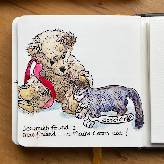
My last Maine Coon, Beorn Bearcat, was this same “blue” color with those huge feet, though Bear had a classic tabby pattern on his sides. Our other granddaughter used to collect Schleich figurines, mostly horses, but I doubt she ever found a Maine Coon (even though she is claimed by 2 of the breed). So I decided to buy it as a pet for my wee mohair teddy bear, Jeremiah.


The ink sketch was done at the cabin as I waited for the laundry to finish. Then I added color today at the farm. I’m still not sure which I prefer: sketch in ink only, ink with watercolor cat, or watercolor wash on everything.


19 November 2019

an odd hearth


The fireplace here on the farm was apparently seldom used. Why else would they build a hearth out of wood? Not exactly fire-safe! We aren’t sure what changes our daughter and son-in-law will make here — maybe a real stone hearth? Or a simple fix would be to cover the top with ceramic tile.

Too bad it’s not safe to use at the moment — we would need to have the chimney inspected by a chimney sweep. A fire would be lovely for when everyone meets here for Thanksgiving.

18 November 2019

Veterans Day, a week later


Hidden in the bottom of my purse today, I found this flattened crepe poppy. Last week we spent Veterans Day in Needville, attending programs to honor relatives and friends of the students that served or are still active in the military. Not only students, actually — a Coast Guard serviceman in dress uniform came at his mother’s request (she’s a teacher).

Ceremonies were held at Judah’s elementary school, Josiah’s middle school (theirs was actually held at the high school), and Jayna’s junior high school — which kept us busy running from school to school! Bill is a veteran of the U.S. Navy, having served during the Vietnam war.

BTW, the Kaweco Liliput fountain pen shown in the picture was skipping badly, even after cleaning the nib with a pen flush solution and installing a new ink cartridge. After fighting with it the past week, I suddenly thought of trying a Waterpik made to clean between teeth. The tiny pressure-jet spray of water worked! The pen now writes very smoothly.

16 November 2019

battle of the birds


On Friday evening we drove to Bryan __through Horrible Traffic due to Texas A & M hosting a home game in College Station on the following day__ to watch our granddaughter Jayna’s halftime performance in high school district playoffs. Jayna is not in high school quite yet but her band director wants her to play with the marching band.

It was very cold in the stands with the recent arctic front bringing winter weather to our part of Texas, but the band did great and the Needville Bluejays beat the Canyon Lake Hawks, 40 to 33.

I carried my sketchbook, a colored pencil, and a small Kaweco Liliput fountain pen in my pockets but my fingers didn’t want to play in the cold . . . So I took photos to sketch a few images when we returned home, to remember the time in my journal.

15 November 2019

my temporary art space


Eventually this side room in our daughter’s new house will be our son-in-law’s office, but for now I have claimed it as a makeshift art studio. There are even some built-in bookshelves high on one wall that hold some of my journals and art books.

The taboret on wheels that Bill made me is meant to sit beside my table (which was actually the desk my grandfather used to hold an old-fashioned cash register in his barber shop) and pulled out as needed. But for now it sits in the corner with a wall shelf sitting on top for additional storage. The wall shelf came out of one of the bathrooms but our daughter didn’t want it.

My large studio lamp is still in storage, but that wee flip light on top of the shelf works fine for when additional lighting is needed. The window faces east and allows for plenty of natural light. When we move to the barndominium, my art space will have north facing windows as well as one on the west.

Now if I would just make the time for some serious art-making . . .


14 November 2019

random pages


Lately I have been doing more reading and errand-running more than sketching or painting. Yesterday, on the way to a meeting with our insurance lady, I picked up this oak leaf in our yard and lightly sketched it with a pencil as Bill drove us to the meeting. Most leaves here either stay green on the trees through winter or a few of them turn to golden-brown and fall. Red oak leaves are rare! So of course I had to record it in my journal — I inked it in later, then added watercolor.


Our daughter set me up to check out ebooks at her library so I could read them on my iPad Mini. The first book I downloaded was The Notebook by Nicholas Sparks. I vaguely remember seeing the movie years ago but had never read the book. As is the case with most books-turned-to-movies, the book was so much better! I often jot down lines from books that I especially like.

09 November 2019

a bedroom view


Our temporary bedroom in our daughter’s farmhouse — the bed is from her Houston guest room (ours remains at our cabin), the cedar chest is from my paternal grandmother, and the folded quilt is from my maternal grandmother. I like the room’s slanted ceilings and window shutters; our cats love the deep window sills with a view.

31 October 2019

just for fun


The above thought came to me as I was watching a recent sunrise out the kitchen window . . . so I jotted it down in my journal. Then sketched the obvious choice: a paint palette.

This limited set has Prussian blue instead of the more common cool blue choice of phthalo blue. I find that phthalo blue tends to overpower every mix I try to make with it. I’m just not very good at using phthalo pigments!

But I quickly discovered that Prussian blue (and any mix containing it) strongly stains any surface it’s mixed on! Now I’m going to have to re-spray the lid of this paint box.


After posting the sketch on Facebook, Kathleen Swanson Roush shared this Rudyard Kipling poem with me . . . so I added it on the next 2-page spread.

29 October 2019

view from the pool


Up until the last couple of weeks, I would swim in the late afternoon, sometimes into evening as the sun was setting behind the tall trees. As the sun disappeared in the west, this is the view I saw from in the water looking towards the south. The setting sun regularly painted the lower sky and clouds in pearlescent shades of pink, coral, and purple.


Then the water became too cold to get in the unheated water. The last two times I was in the pool, this froggy thermometer said it was 75°. That first plunge was quite chilling! I don’t think I’ll swim any more this year . . . unless our son-in-law goes ahead with his plans to add a pool water heater.

27 October 2019

Sketch With Me: CHANGES


Real in-the-flesh sketch crawls were so much easier! A group of like-minded sketching friends used to meet together at a chosen monthly location where we would each draw whatever caught our eye or imagination, then meet together somewhere and share our work with each other. No distractions or need to share the time with other stuff. These virtual sketch crawls are harder for me, seeming to always fall on days with other things already on the calendar. And since none of my local friends or family sketch, I’m pretty much on my own in trying to fit some drawing time in.

This weekend’s Sketch With Me theme was “changes”. I had already decided what to sketch but we would be away from the farm. Saturday morning we had breakfast at our daughters Houston home, then I spent the morning hemming an FFA skirt for Mikala. In the afternoon we attended her band competition. I drew a bit here and there between times.

Sundays find us back at the cabin — we attend church and spend the day doing the weekly laundry. But today was also “Snack n’ Yack / Movie Night” at church. Again, I worked sketching in here and there as I was able.

My “changes” show some of what Bill has been up to here on the farm. Bill and son-in-law Michael tore out the two old tack rooms in the SW corner (where our bedroom will one day be). And now Bill is using the reclaimed wood to build inside walls and ceiling to the small shed. He is also adding electricity and insulation (that’s insulatieon rolls in the car).


But as long as the theme is “changes”, I also switched the limited palette in my Demi Palette to one that mimics Cathy “Kate” Johnson’s favorite limited palette. I choose different primaries and add a convenience green. And of course that meant changing the color card inside my clear phone case!


24 October 2019

a bit of unexpected gold


Now that the excessive heat has calmed down (it’s now in the 80s) , I am once again trimming and weeding the landscaping around the pool. But the planting beds in front of the barn have been totally neglected. I happened to glance that direction as I was returning from the mail box (a very L-O-N-G distance from the house), and noticed that a shrub that used to be around 3’ tall now towers over our heads! It is covered with these yellow trumpet-shaped blooms, so thick that the top is leaning over.

I looked it up online: it’s called Esperanza, or Yellow Bells, and is related to trumpet vine.

23 October 2019

an odd apartment building


As we were looking for an alternate way to drive to Navasota, we came upon this odd 6-sided structure on Highway 105. The shape reminded me of the ancient tower houses of Scotland and Ireland but built of wood instead of stone. Apparently it has 3 studio apartments, one stacked atop the other, with an outside staircase. The realty company that owns it also uses it as a huge billboard, though some of the banners are faded.

17 October 2019

an oak tree limb


I was wondering about outside today. After last night’s rain, there are broken twigs and bits all over the place — this one from one of the taller oaks has wee nubbins of immature acorns on it. I don’t remember ever seeing acorns before they’ve developed before.

15 October 2019

old hitching post?


This curiosity is next to a small metal building on “the farm” that the former owners called a “shop” — it’s more like a small shed with a big porch. We assume this was used as a hitching post for their horse? But in front of the posts is a shallow wooden box full of gravel. Maybe it’s extra gravel for the long driveway? If so, there’s not nearly enough.

UPDATE:
The previous owners kept sheep. Someone on line thinks this might be for cleaning the sheared fleeces (over the gravel), then hanging the fleeces over the post to dry. 

14 October 2019

Bradley the not-so-brave


Our buddy Bradley, who is actually afraid of the swimming pool, saw leaves in the bottom of the pool . . . and was sure his favorite frog had returned to play. Son-in-law Michael got to drive home a very soggy dog! Bradley is part Great Pyrenees, part golden retriever, and 100% goof-ball.


12 October 2019

a simple kit


Because of my love of Pocket Palettes, I have quite a few plastic pans of paint stored away that never get to come out to play. Recently I saw an Instagram post from “sketchbyfay” of her travel palette, with everything but the water container fitting in a simple metal pencil box.

* Fay’s blog can be found here!


I made a quick sketch of Fay’s kit to remind me to try putting together something similar. I just happened to have a similar pencil box and all those forsaken half pans of watercolor . . .


Now if I could just find where I packed that glossy white contact paper — it makes a simple adhesive mixing surface for inside the lid.
Related Posts Plugin for WordPress, Blogger...