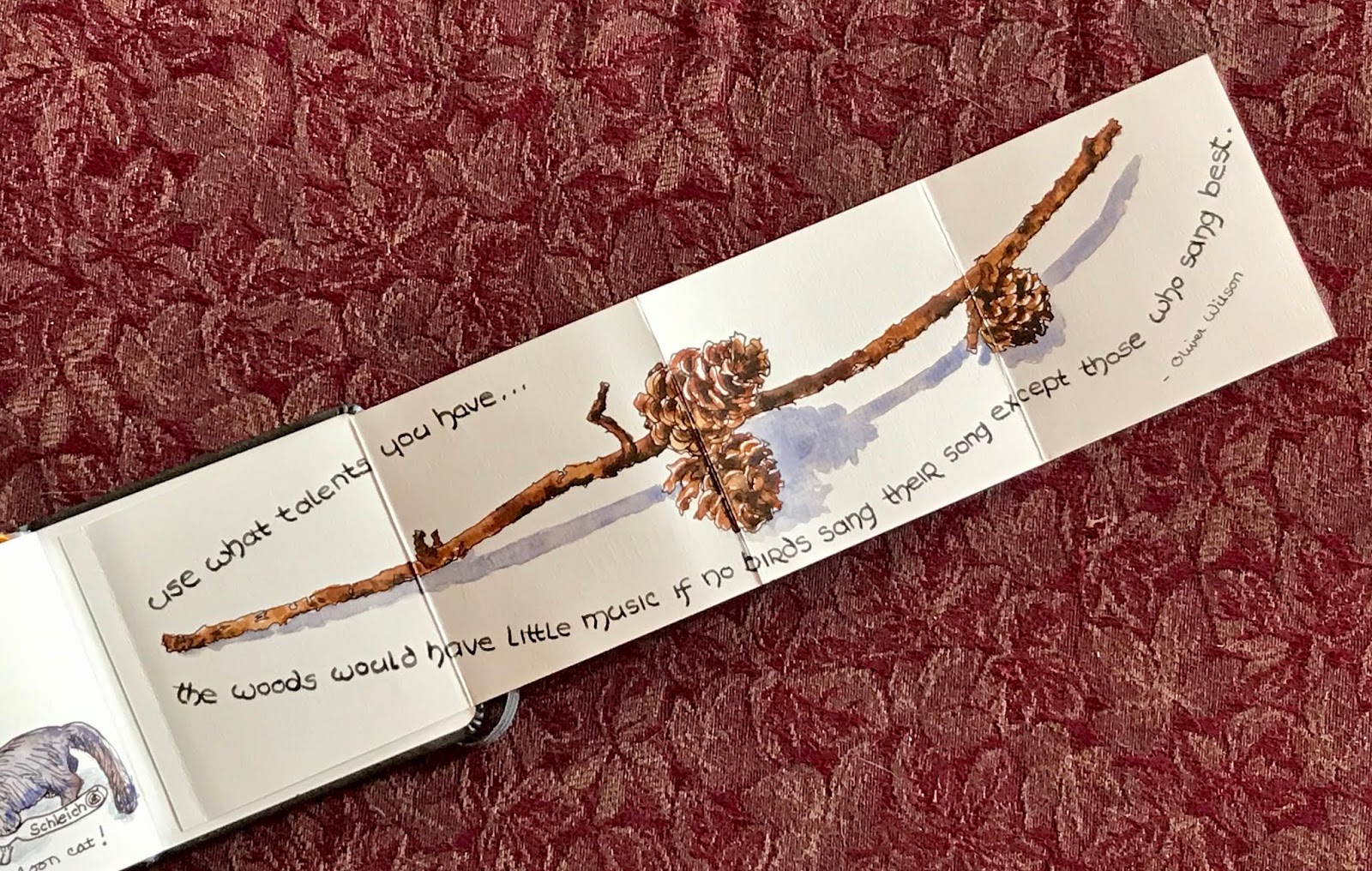
The final “page” in my current journal, a 4” square Field Artist watercolor journal that I found on Amazon, is actually a fold-out landscape page — just in time to fit the branch Bill brought me this week to sketch. We have had very windy days lately and many oak trees seem to shed bits of branches as often as they do leaves.
I was also testing a medium gray ink that I just mixed. On this smoother side of the paper, it looks to be the exact shade I was trying for. That’s the mixed gray in the text, written with a Duke 209 fude nib fountain pen. The branch was drawn in a continuous line with De Atramentis Document brown.

But on the reverse side of the paper, which is a bit textured, the new gray seems a bit darker than expected. When I tried it on plain white paper, it seems about right in person, though it looks dark in the photograph. The black of the top line is very black but doesn’t look so dark due to being written with the very fine nib of my Namiki Falcon pen. The bottom line on the white paper is written using Noodler’s Lexington Gray ink, which I also used in the light areas of the ink bottles and shadows.
I am following fellow sketchbook artist, Larry D. Marshall, in learning to mix my own gray ink. His blog post can be found HERE. I had just purchased a new bottle of De Atramentis Document Black ink, so I thought I’d give it a try with the little bit of ink left in the old bottle. I added 5 parts dilution solution to 1 part black. Overall, I’m happy with the outcome, but it seems to depend on the paper what the medium gray will actually look like.
BTW, you can find lots more on mixing this brand of inks on Jane Blundell’s blog, found HERE.

No comments:
Post a Comment