
Yet this year, I have juggled multiple journals simultaneously — a class, a vacation, a month-long challenge, and simply wanting something smaller to carry in my purse. Most of my bags have room for the journal size I usually prefer, about 5 1/2 x 8 1/2”, but I tend to change purses quite a lot! Sometimes I just want to carry something tiny and light-weight, and it just seems WRONG to not have a sketchbook with me. Even if I don’t actually do anything in it.
So, even though my current regular journal (a Stillman & Birn Beta softcover) has several more pages to fill, I went ahead and started this new smaller (3 1/2 x 5 1/2”) one to carry with me. The pages are a warm beige tone and the paper lighter weight than I normally work on.

I wasn’t sure how watercolor would look against this beige tone, so I tested both watercolor and gouache. I was pleasantly surprised that both look equally bright! Being lighter paper, I did use less water in my brush — loose washes would probably make the paper cockle.
I also tried out several inks to see how the tone affected them, if at all. One big surprise was that J. Herbin Lie de Tie, which is normally a light golden water-soluble brown, appears much darker when washed out on this paper. Also, De Atramentis Document black ink appears as a richer black than Platinum Carbon black.
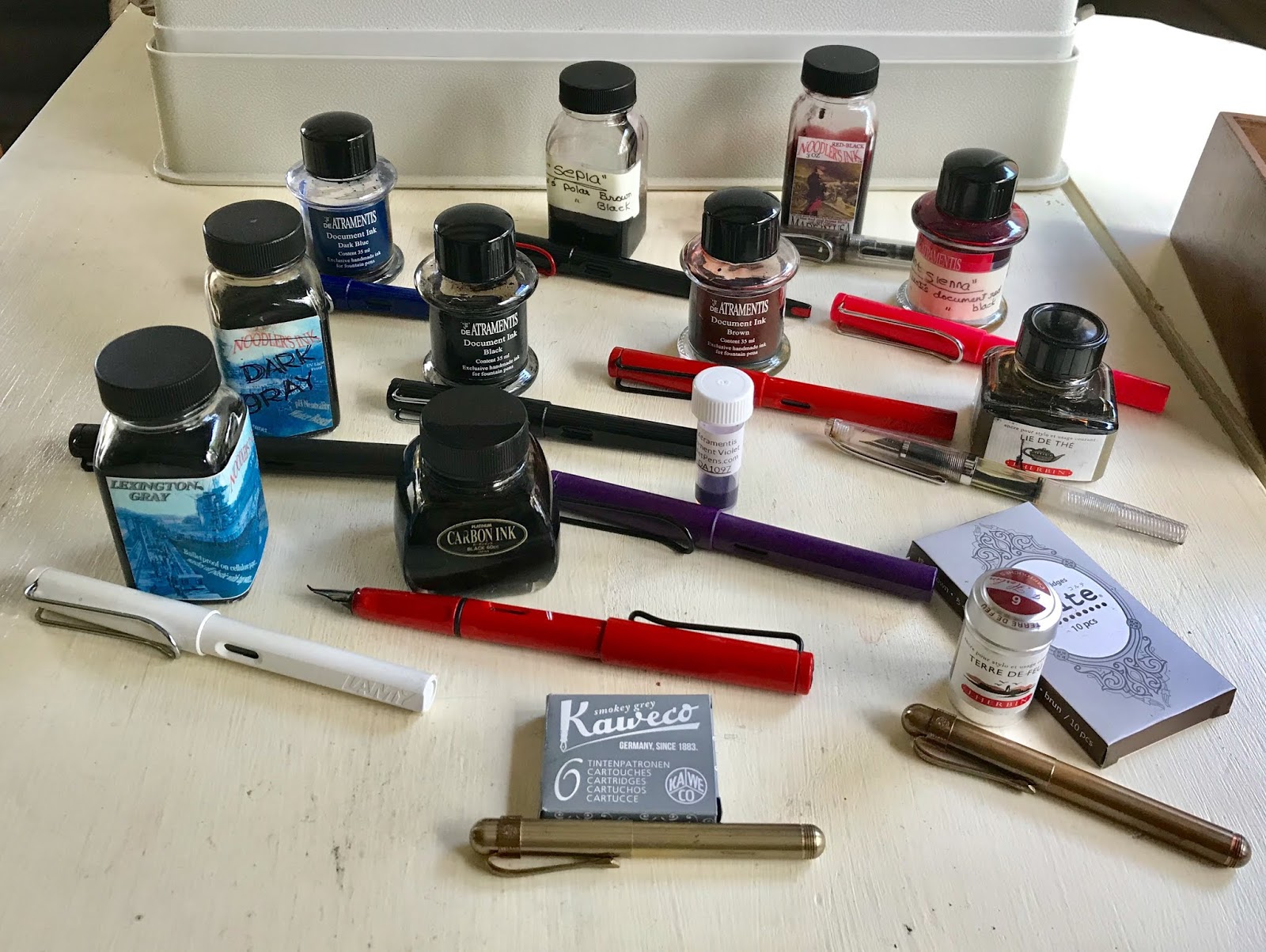
As long as I had to refill several pens, I decided to take a reference photo of each of my current inks and which pens they are in. I forgot to include my Duke 209 fude pen, which is filled with document black ink. Apparently I also forgot the 2 Kuretake brush pens — the one filled with a diluted Lexington Gray ink will probably be used often on this paper for tonal sketching.
What used to be De Atramentis Document red ink has been altered to my own blend of “burnt sienna” ink by simply adding a few drops of Document black ink to the red. The “sepia” is a blend of leftover Noodler’s polar black and polar brown. The dark gray is the result of several inks; whenever it’s used up, I probably won’t replace it. The same goes for the Noodler’s red-black and the De Atramentis dark blue — I just don’t use them enough to warrant replacing.

Love these two pages, Vicki. I'm curious. Do you principally work in gouache with some watercolor or the other way around?
ReplyDeleteMostly I work in watercolor (and ink, of course!) — it’s what I’m familiar with. But for toned or lighter-weight papers, I’ve been playing around with gouache. Usually these gouache attempts are too dark and a bit clumsy!
DeleteI love watercolor’s fresh, light-filled transparency so it will always be my favorite.