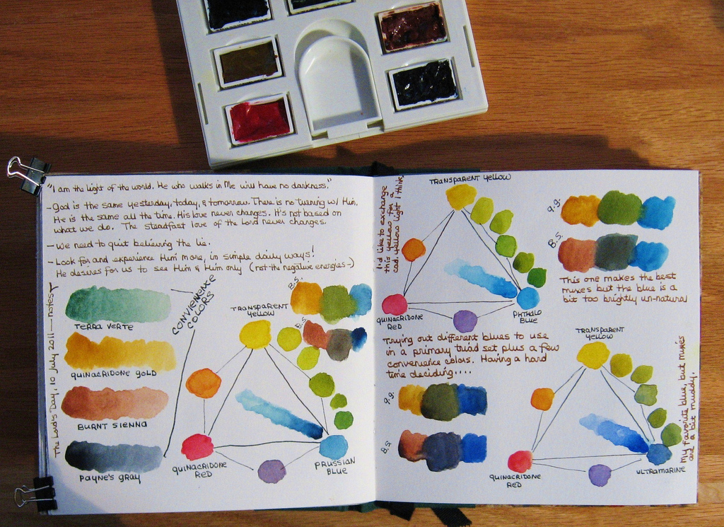
So I turned it into a primaries + convenience colors palette. Seems to work especially well, given all the extra mixing places (there's an additional mixing tray that slides out from below).
I was pretty sure which red and yellow to use (I may switch the transparent yellow to a cadmium yellow light when I get a chance to buy some). But blues baffled me. My favorite blue is ultramarine, but the greens are a bit too dull. Phthalo blue makes the best greens, but as a stand-alone color I find it a bit too strong & unnatural. So maybe Prussian blue is a good choice?

No comments:
Post a Comment