I used to jokingly tell people that my favorite color is plaid. As in a classic Scottish tartan, which I really do love. I did not really have one favorite color — I love them all!
But this past couple of years, I have been drawn to turquoise in its many variations. Especially when paired with rich brown — a friend at church had a leather handbag with touches of turquoise that really captured my eye.
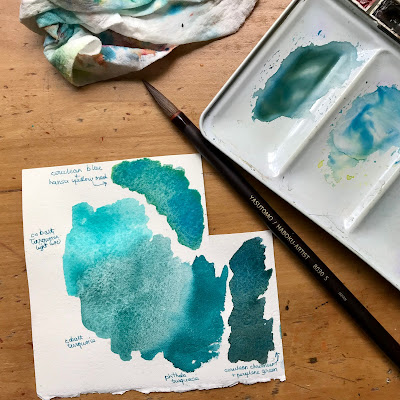
So my one extra “just for fun” paint is turquoise. Actually I currently have three: a leftover cobalt turquoise light from Winsor & Newton, and cobalt turquoise and phthalo turquoise from Daniel Smith. Yesterday I wanted to play with this Japanese bamboo brush so I painted the three different turquoise paints side-by-side. Then tried making a turquoise using cerulean chromium, which is made of the same PB36 pigment as cobalt turquoise. The mix with Hansa yellow medium had a mesmerizing separation of green and blue. Cerulean chromium mixed with perylene green made a lovely teal which looks much darker in the photo than it really is.


No comments:
Post a Comment