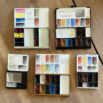
I may have gone a bit nuts collecting my favorite palettes from Art Toolkit. I’ve pretty much stopped using any other palette design, loving how easy it is to swap pans in and out of these metal cases. The shallow pans allow even bigger brushes to pick up paint without damaging the bristles by digging deep into those plastic pans that I used to use.
Each are currently filled with a type of “special use” group of colors — easy to quickly grab just what I’m in the mood for! (all paints are Daniel Smith except a few marked W&N for Winsor and Newton)
The silver Pocket Palette, upper left, contains a CMYK palette with 2 convenience colors added:
quinacridone magenta (W&N), hansa yellow medium, phthalo blue GS, Jane’s grey, green apatite, and burnt sienna.
The black Pocket Palette, upper right, holds my version of an extreme limited plus mostly neutrals palette, inspired by artists Róisín Cure and Suhita Shirodhar:
lunar red rock (a more transparent version of Indian red), monte amiata natural sienna, cerulean blue chromium, ultramarine, transparent red oxide, indigo, burnt umber, a mixed pan of transparent red oxide and indigo, and white gouache.
The black Demi Palette, lower left, holds a warm and a cool of black and white for working in gray tones. Great on toned paper!
buff titanium, grey titanium, lunar black, and Jane’s grey.
The coppery color Pocket Palette, lower center, holds earthy granulating pigments, especially great to use in autumn:
lunar red rock, monte amiata natural sienna, green apatite, cerulean blue chromium, lunar blue, lunar violet, buff titanium, transparent red oxide, burnt umber, and lunar black.
The silver Demi Palette, lower right, holds my version of a late 19th century limited palette plus 3 pans of convenience colors:
quinacridone burnt scarlet, quinacridone gold, ultramarine, sepia, and lunar black, plus raw umber violet, buff titanium, and undersea green.
potter's pink (W&N), quinacridone red, quinacridone gold, hansa yellow medium, serpentine, green apatite, undersea green, cobalt turquoise light (W&N), cobalt turquoise, cerulean blue chromium, ultramarine blue, indanthrone blue, monte amiata natural sienna, transparent red oxide, piemontite or lunar red rock, buff titanium, titanium gray, lunar black, and Jane's grey.


No comments:
Post a Comment